Overview
A comprehensive brand manual and visual identity system for Linux, establishing a modern and cohesive brand language. This project encompasses logo design, typography standards, color systems, brand applications, and detailed usage guidelines that maintain Linux's technical heritage while embracing contemporary design aesthetics.
Project Goals
- ▹Establish a distinctive and modern brand identity for Linux
- ▹Create comprehensive brand guidelines for consistent application
- ▹Develop a flexible visual system that scales across platforms
- ▹Balance technical heritage with contemporary design aesthetics
Tools Used
Timeline
- Brand Research: 1 week
- Logo Development: 2 weeks
- Visual System: 2 weeks
- Brand Manual: 1 week
Why Redesign Linux's Brand?
Before beginning the redesign, research into Linux's existing brand presence revealed several key problems that motivated this project:
Fragmented Identity: With hundreds of distributions each applying their own visual treatment, there was no unified brand language that communicated “Linux” as a cohesive platform — making it harder for newcomers to identify with the ecosystem.
Dated Visual Assets: The existing Tux mascot and associated graphics, while iconic, had not been systematically refined for modern digital contexts — resulting in inconsistent rendering across websites, documentation, and merchandise.
Perception Gap: Linux powers the majority of the world's servers, smartphones (via Android), and cloud infrastructure, yet its brand still carries a “hobbyist” perception for many non-technical audiences. The redesign aims to close that gap between what Linux actually is and how it looks.
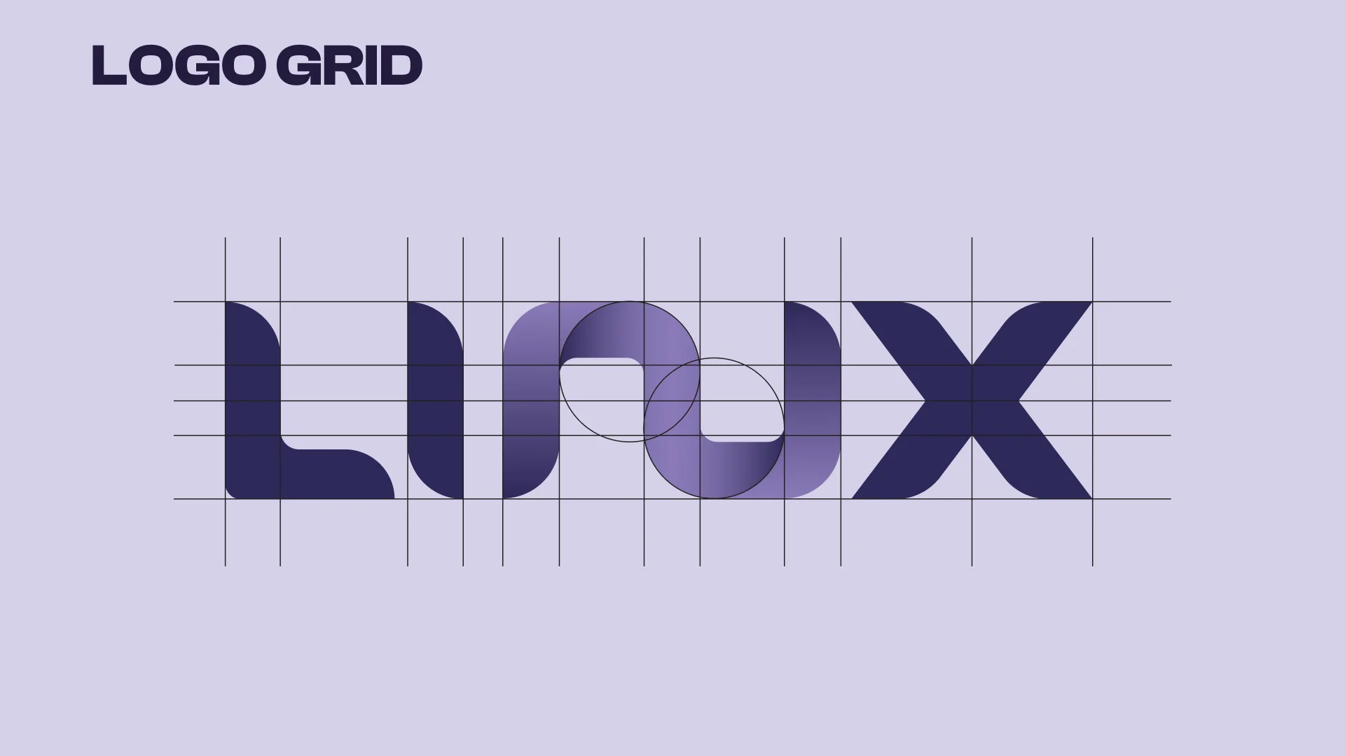
Logo Design & Construction
The Linux Reimagined logo represents the fusion of tradition and innovation. Built on precise geometric principles, the logo combines technical precision with organic elements, symbolizing Linux's powerful yet accessible nature.
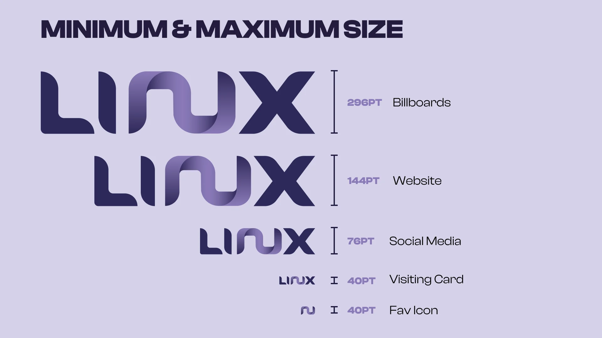
Logo Variations & Sizing
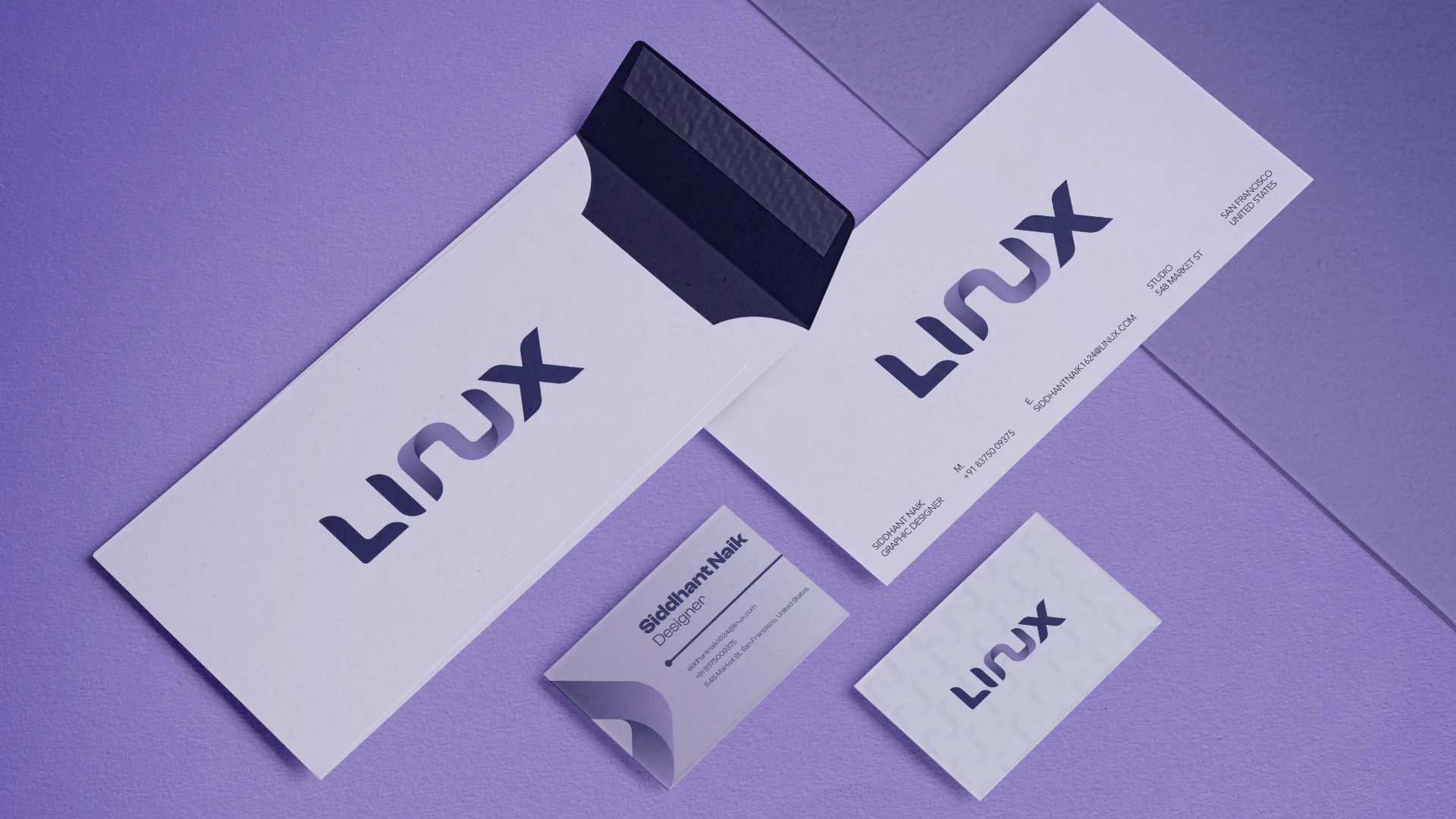
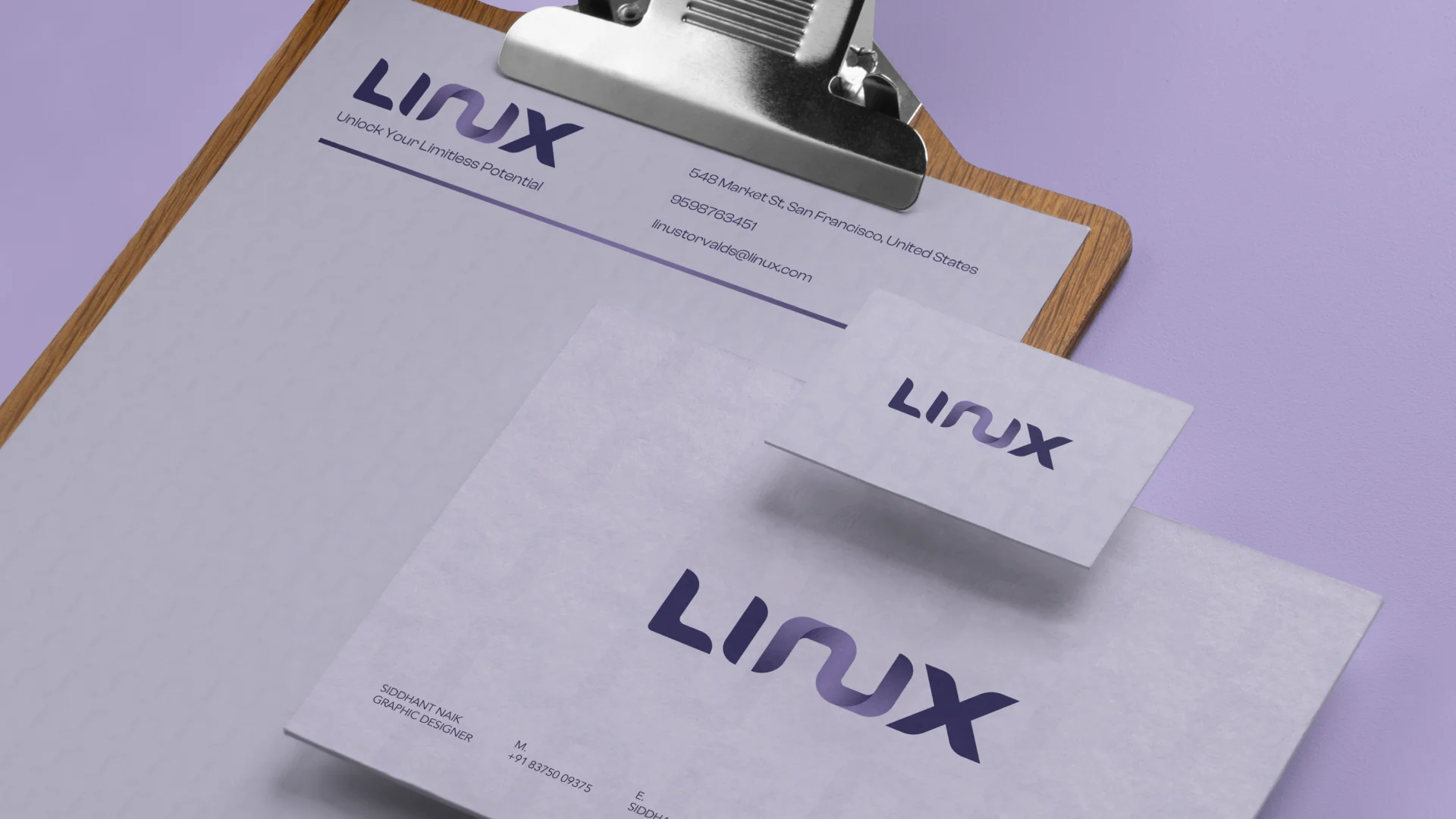
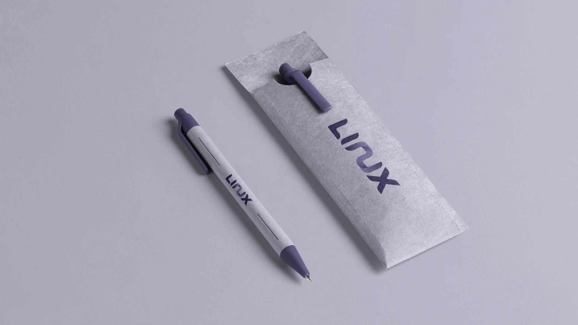
The logo system includes multiple variations designed for different applications and contexts. Each variation maintains brand integrity while offering flexibility for various use cases, from digital interfaces to print materials.
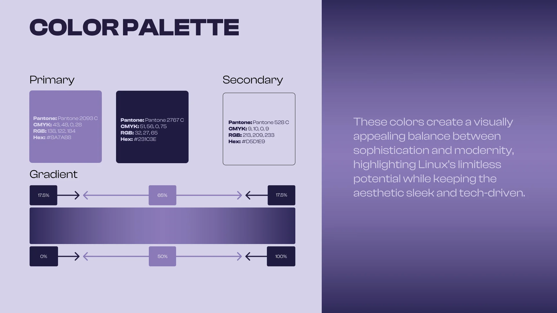
Color System
A carefully curated color palette that balances professionalism with approachability. The primary colors reflect Linux's technical heritage, while the supporting palette adds warmth and accessibility to the brand.
Color Applications
Primary Applications
The primary color palette is used for key brand elements, ensuring strong brand recognition and visual consistency across all touchpoints.
Supporting Colors
Supporting colors provide flexibility for various contexts while maintaining brand harmony and visual hierarchy.
Typography System
The typography system balances readability with technical precision. Selected typefaces offer excellent legibility across digital and print media while reinforcing the brand's modern, professional character.
Brand Patterns & Graphics
Custom brand patterns and graphic elements extend the visual language. These elements can be used to add depth and interest to brand communications while maintaining visual consistency.


Pattern Applications
Digital Media
Patterns enhance digital interfaces, adding visual interest without compromising usability or brand clarity.
Print Collateral
Applied to brochures, documents, and promotional materials to create cohesive brand experiences.
Environmental Graphics
Scaled patterns work across large-format applications, from signage to exhibition spaces.
Usage Guidelines
Clear guidelines ensure consistent brand application across all touchpoints. These standards protect brand integrity while providing flexibility for creative expression.
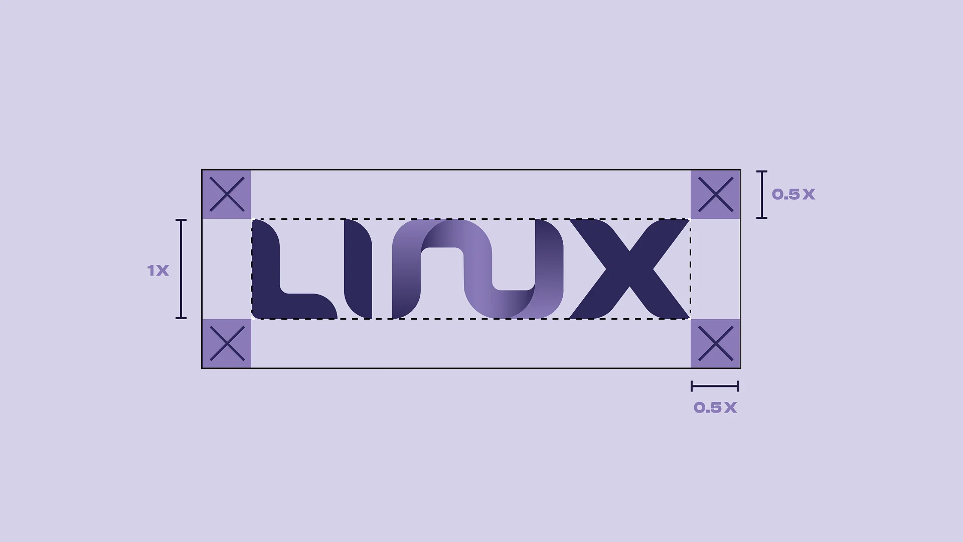
Clear Space: Maintain minimum clear space around the logo equal to the height of the penguin element.
Minimum Size: Logo should never be reproduced smaller than 24px in height for digital or 0.5 inches for print.
Color Usage: Use approved color variations only. Never alter logo colors or apply gradients.
Placement: Position logo prominently with appropriate visual hierarchy and context.
What Not to Do

Do not change the background color of the logo.

Do not position the logo on angles.

Do not distort the logo.

Do not add effects to the logo.

Do not change the color of the logo.

Do not add elements to the logo.
Brand Manual Gallery