Overview
A UI/UX project designed specifically for senior citizens, focusing on simplifying daily medication management. The app includes features like medication reminders, a pill identifier, and an easy to use interface, demonstrating a user centered approach that prioritizes clarity, accessibility, and real life usability.
Project Goals
- ▹Improve user experience and interface design
- ▹Create intuitive navigation and user flows
- ▹Develop a comprehensive design system
- ▹Ensure accessibility and usability standards
Tools Used
Timeline
- Research Phase: 2 weeks
- Design Phase: 3 weeks
- Prototyping: 2 weeks
- Testing & Iteration: 2 weeks
Core Problems
The following key challenges were identified for seniors managing their health and medication:
Seniors face age-related physical challenges like reduced grip strength, impaired vision, and limited dexterity, which make everyday health tasks more difficult.
Managing multiple medications can become overwhelming — remembering doses, refill dates, and instructions often leads to skipped or incorrect intake.
Tracking basic health vitals like blood pressure, sugar levels, or weight is often neglected due to lack of simple, accessible tools.
Scheduling and managing doctor appointments is confusing without reminders or centralized access, especially when dealing with multiple health conditions.
About
Pill Pal is designed to simplify medication management, appointment scheduling, and basic health tracking, all in one intuitive platform. With a focus on accessibility, emotional support, and caregiver integration, it empowers elderly users to stay independent while keeping their health on track with ease and confidence.
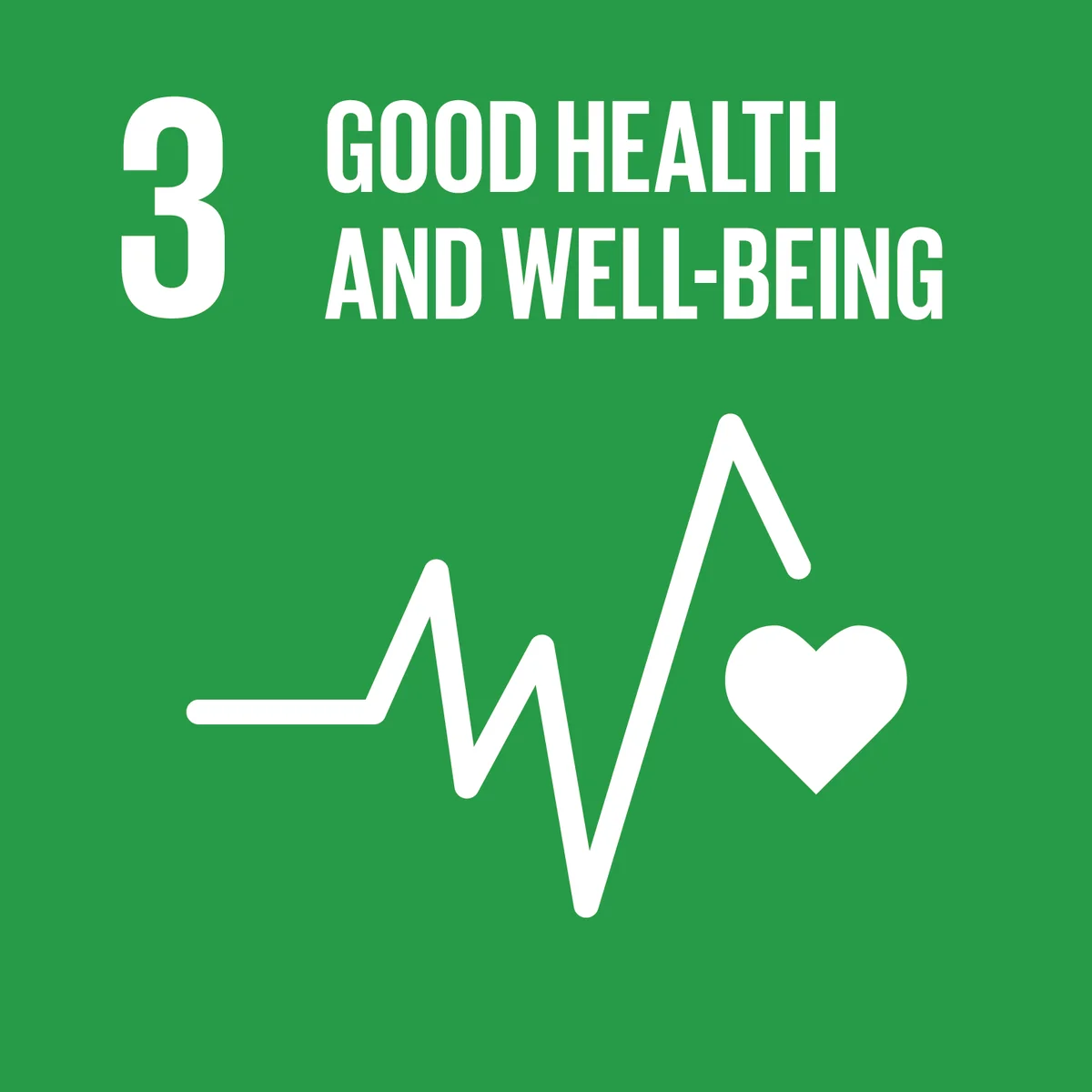
Aligning SDG
For elderly user:
Improves independence and confidence by helping them manage medications, appointments, and health tracking with ease and emotional support.
For the doctor:
Reduces missed doses and health complications, making patient care more consistent, informed, and less reliant on constant follow-ups.
Gaps in the Existing Apps
Priorities were determined through a competitor audit of 5 leading medication apps, combined with heuristic evaluation against accessibility guidelines (WCAG 2.1 AA) and qualitative feedback from user interviews with seniors and their caregivers.
Complex interfaces with cluttered layouts, small text, and too many features
Caregivers can't easily track adherence or receive alerts if medication is missed
Most apps don't allow scanning of pills or packaging to identify or log medication
Very few apps offer accessibility tools and preferences
Users often have to switch apps or call pharmacies/doctors separately
Limited personalization options for individual health conditions or preferences
Most apps feel cold and clinical, missing friendly tones or encouraging messages
Poor regional language support and limited localization for diverse user bases
Features are scattered across multiple screens, making navigation confusing
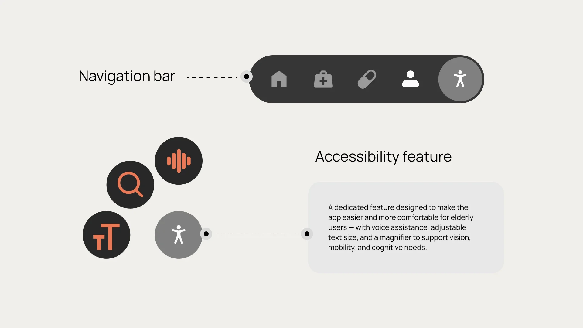
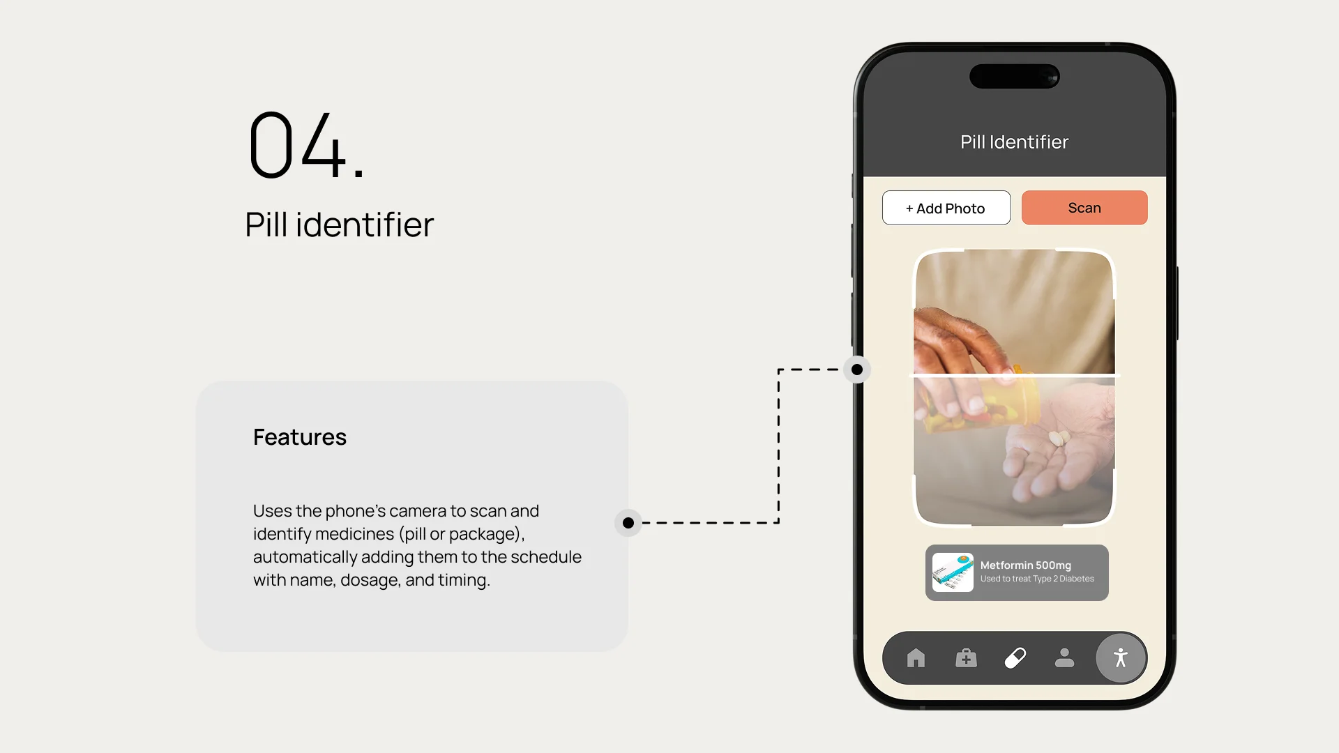
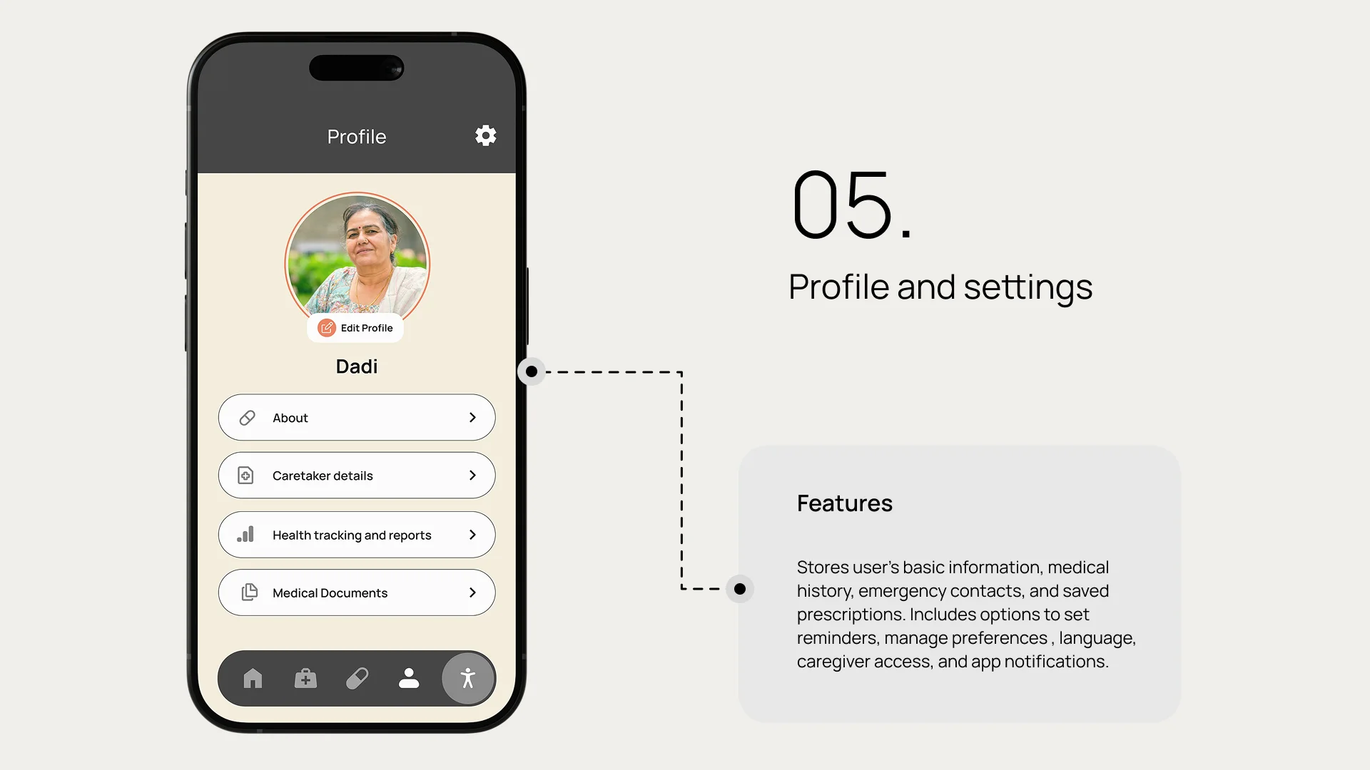
Core Features
The app will use large text, soft but high contrast colors, and clutter-free screens to make navigation effortless for elderly users.
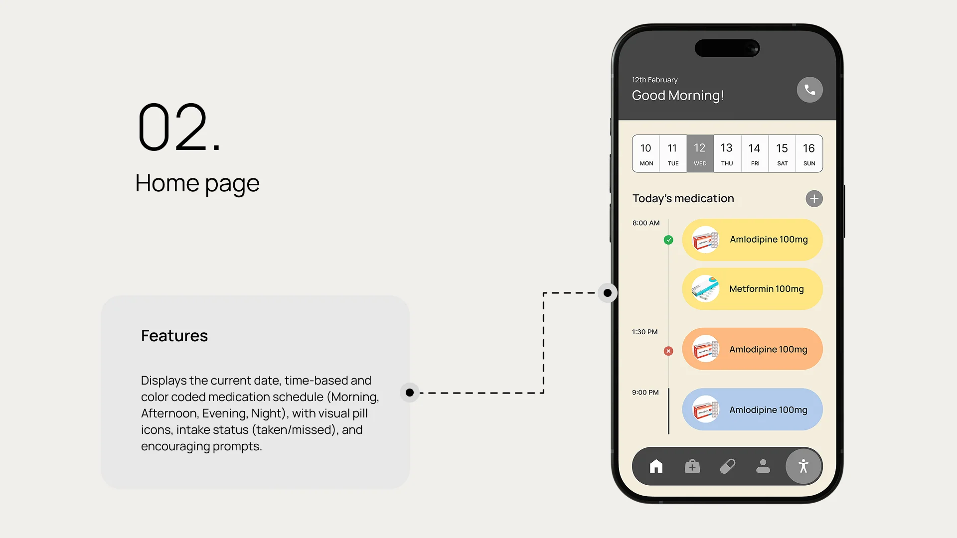
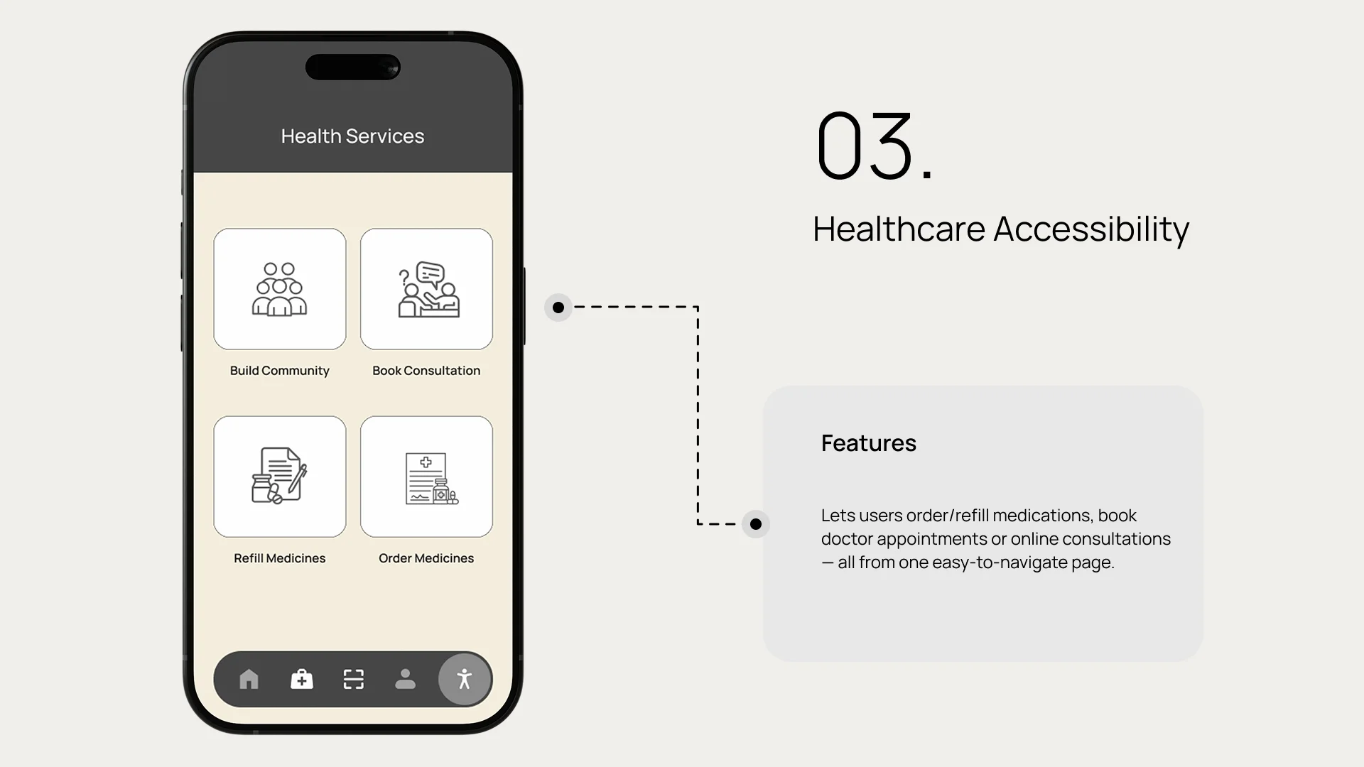
From medication reminders and refill alerts to booking appointments and logging health vitals—everything will be accessible in one place.
Family members or caregivers can monitor progress remotely, ensuring timely support. Features like positive reinforcement and friendly reminders motivate seniors to stay consistent and feel empowered.
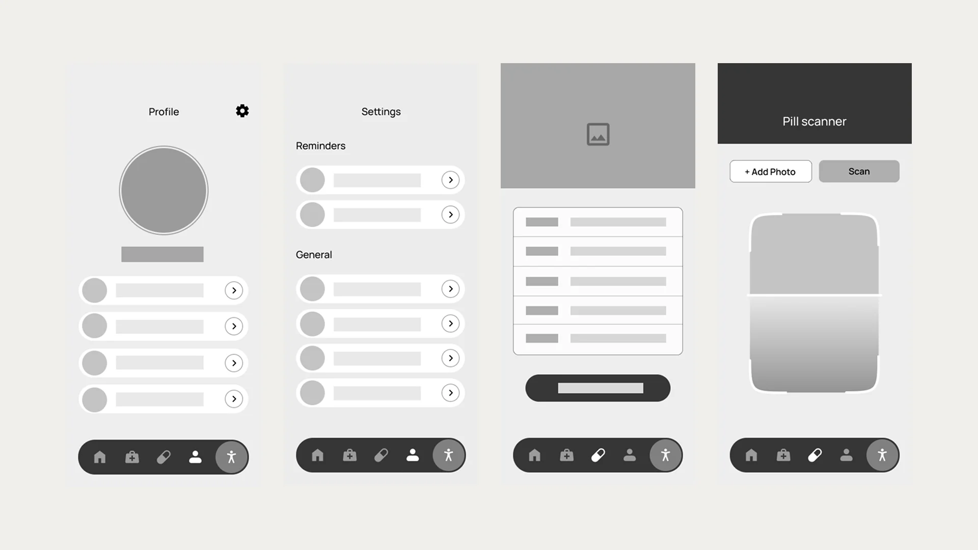
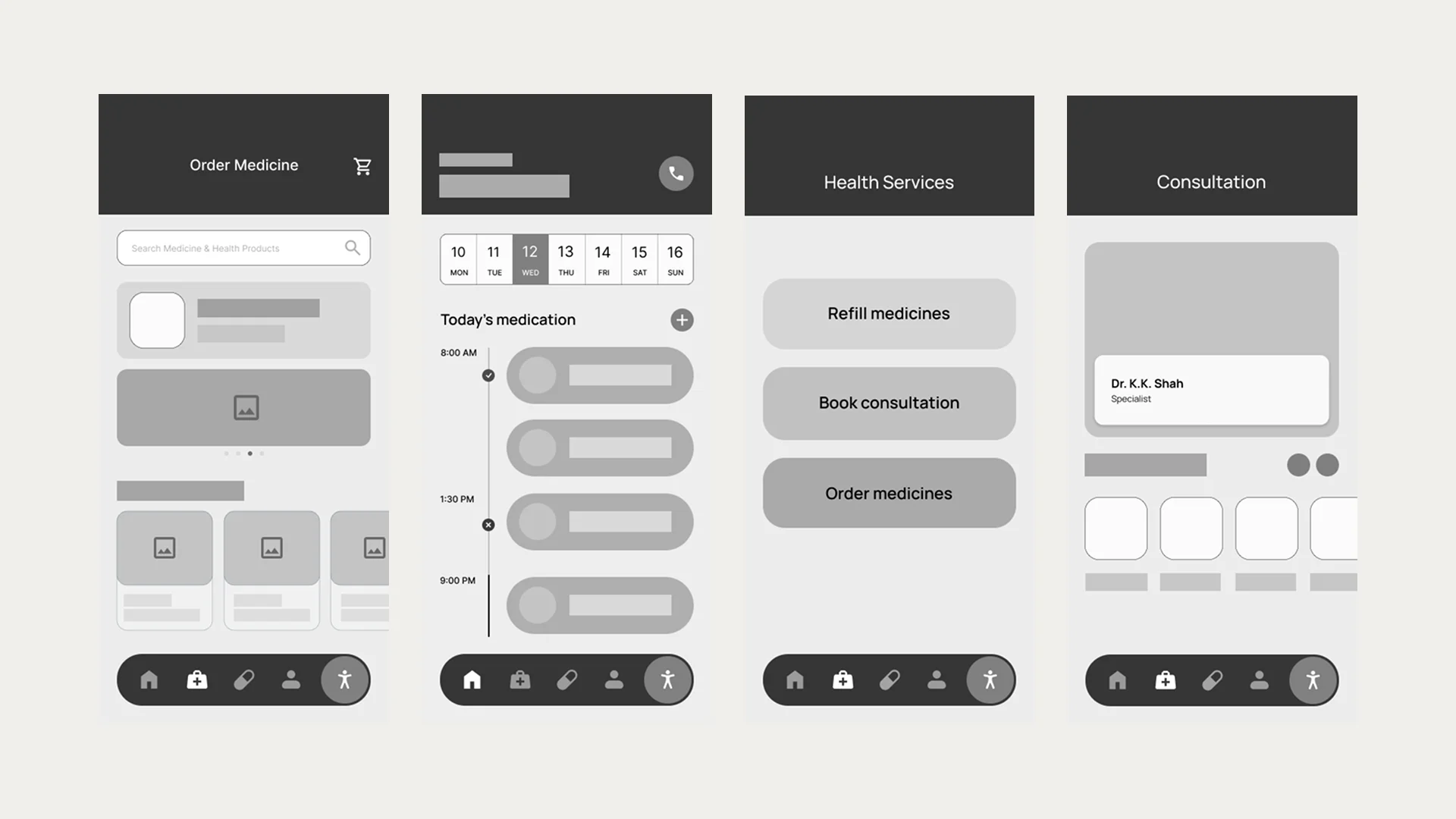
Wireframes
Low-fidelity wireframes were created to visualize the core user flows and screen layouts. These wireframes helped establish the information hierarchy and navigation structure before moving into detailed design.
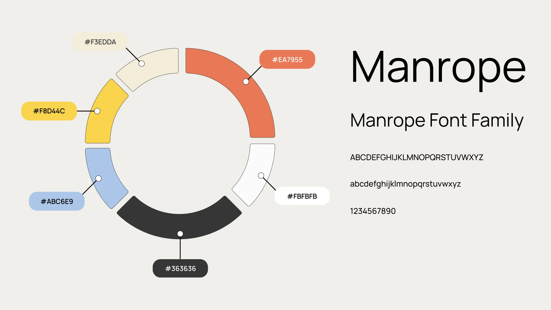
Design System
Color Palette & Typography
A carefully selected color palette ensures high contrast and readability for elderly users. The typography system uses large, clear fonts with generous spacing to enhance legibility and reduce eye strain.
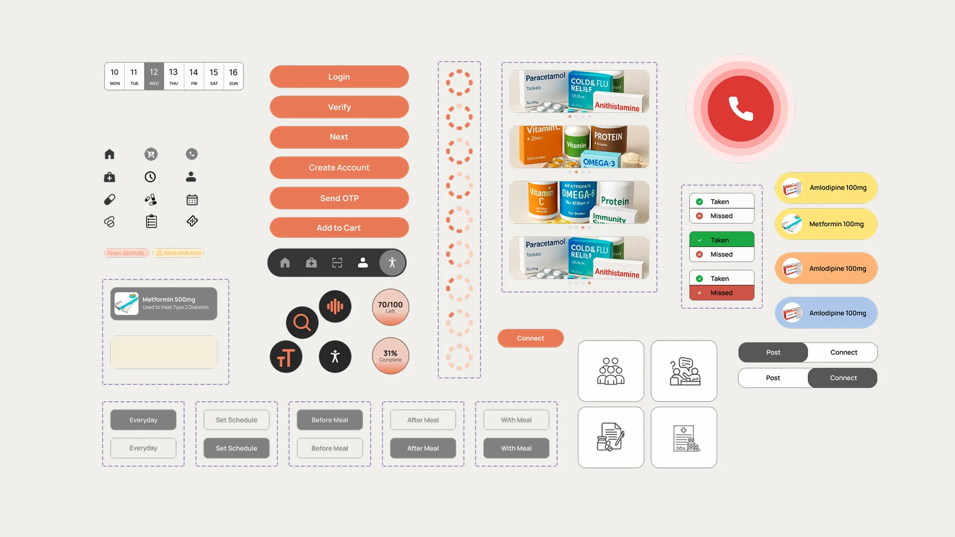
UI Kit
A comprehensive UI kit was developed featuring accessible components designed specifically for elderly users. Each element prioritizes clarity, touch-friendly sizing, and visual feedback.
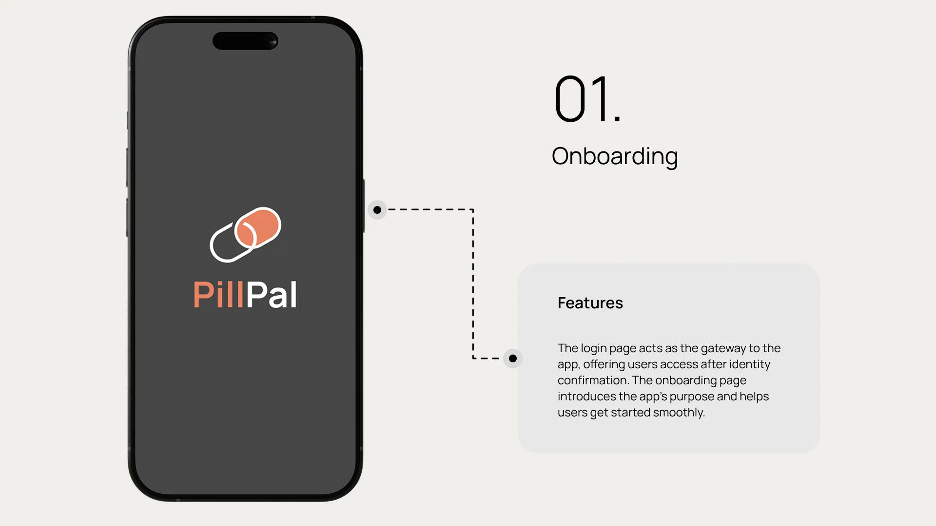
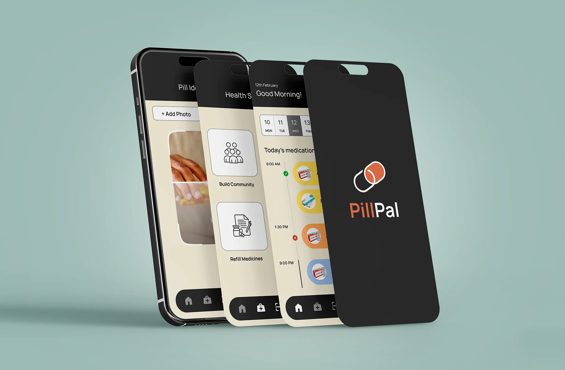
High-Fidelity Designs
The final high-fidelity designs bring together the design system, user flows, and accessibility features into a polished, user-friendly interface optimized for elderly users.