ProFolio
Brand Identity & Product Design
Overview
ProFolio is a platform that helps high school students build professional portfolios for college admissions. This work goes beyond a brand refresh: a complete visual identity, custom logo animation, brand manual, pitch decks for B2B and B2C audiences, a multi-page website with student showcases and program offerings, and an Art & Design Majors microsite to guide students on career paths. This case study covers the journey from research and concept through final execution.
Project Goals
06 ObjectivesDesign a complete brand identity and visual system for ProFolio
Develop an animated logo and motion language for the brand
Build a full-featured web platform for portfolio building
Create pitch decks and marketing materials for B2B and B2C audiences
Design an Art & Design Majors guide to help students explore career paths
Document the full research and design process
Tools & Software
 Adobe Illustrator
 Adobe Photoshop
 Adobe After Effects
 Figma
FigmaTimeline & Process
PhasesWhy Rebrand ProFolio?
Before initiating the rebrand, a comprehensive audit of ProFolio's original 2020 brand identity surfaced critical architectural flaws across visual coherence, digital positioning, and scalability:
Inconsistent Identity
The mark, typography, and palette were applied inconsistently across touchpoints, leaving the brand without a singular recognizable voice.
Dated Visual Language
Color, layout, and imagery still reflected a 2020-era look: generic compositions and treatments that no longer held up as a contemporary design brand.
No Scalable System
Without documented design rules, assets failed to scale cleanly from favicons to large-format print: every piece was treated as a one-off.
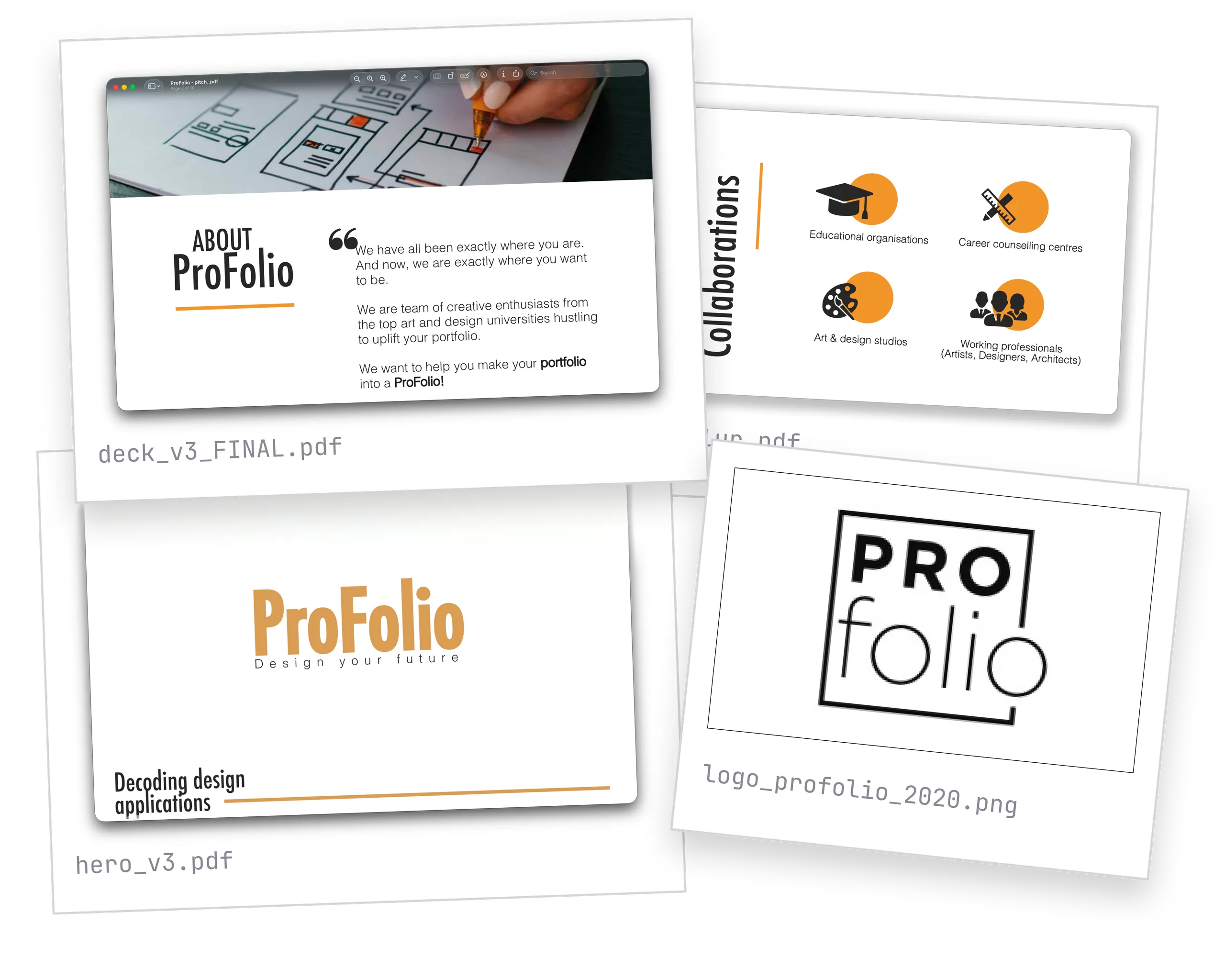
The Old Brand Language
This is the old version of ProFolio's brand language, the 2020 touchpoints before the identity was rebuilt. Multiple logo styles, inconsistent type, and disconnected layouts made the brand hard to recognize, and there was no shared system to carry it across print and digital.
Motion System & Animation
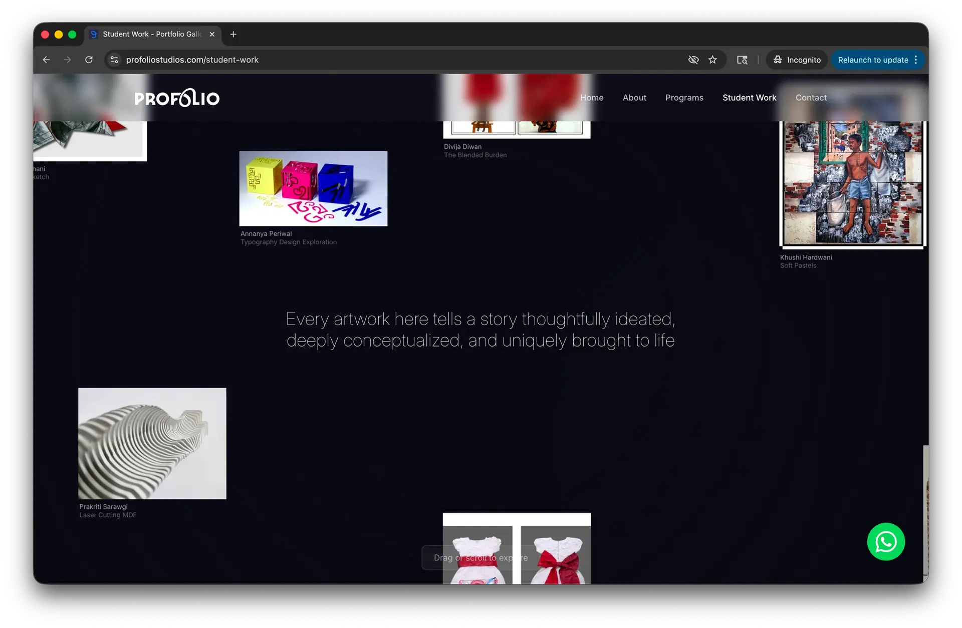
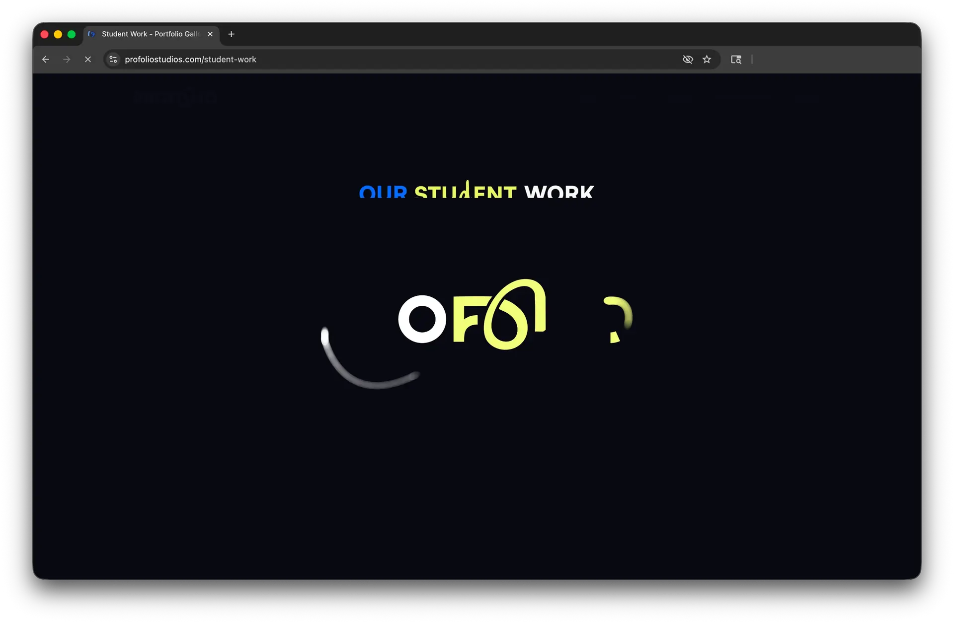
A custom animated logo sequence designed to anchor digital platforms, interactive preloader transitions, and video content. The motion language follows an intentional narrative arc: three independent focal points converge into geometric alignment, dynamically revealing the final ProFolio wordmark.
5-Stage Motion Architecture
Convergence
Three points converge
toward center

Alignment
Focal axes align to
grid geometry
Glyph Formation
Signature brand curvature
draws out
Resolution
Wordmark typography
scales in
Final Reveal
Identity locks into
full lockup
Preloader Mechanics on Web
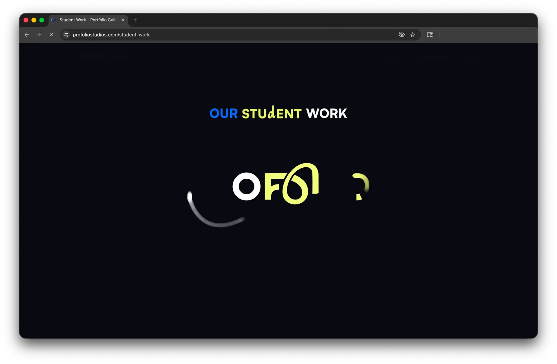
The animation sequence acts as an interactive website
preloader, synchronizing page hydration with brand motion.
Logo Iterations
The ProFolio wordmark went through an extensive iteration process from 40+ rough concepts narrowed down to 3 distinct directions, each refined through construction, spacing, and proportion studies before arriving at the final mark.
Logo Design & Construction
The refreshed ProFolio mark is built on a precise geometric grid, balancing technical structure with an approachable, contemporary feel. The construction guarantees the logo stays consistent at any size.
Exclusion & Clear Space

Vector Bezier Anchor Points & Geometry
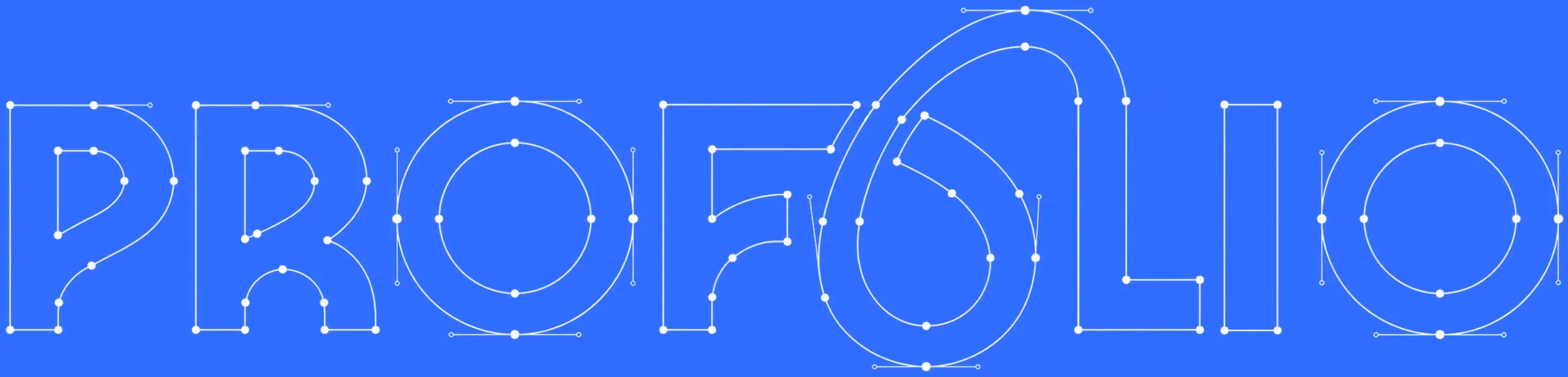
The lime FOL glyph is derived from the F, O, and L letterforms in the PROFOLIO wordmark, pulled out
as a standalone brand mark for compact applications. Hover to reveal it on the construction grid.
Logo Variations & Sizing
A full set of primary, secondary, and responsive lockups ensures the brand reads clearly across every context from a compact app icon to full-width hero placements with minimum-size guidance to protect legibility.


Geometric Grid Construction
The wordmark is drawn on a construction grid so letter heights, counters, and spacing stay aligned. Those hairlines are the structure behind the mark, not decoration.

Horizontal construction lines locking cap height, baseline, and internal alignments.
Logo Do's & Don'ts
Clear usage guidelines protect the integrity of the mark. These examples highlight the most common misuses to avoid when applying the ProFolio logo.
Toggle common misuses on a live mark. The approved state is an unaltered blue wordmark on soft white.
No violations. This is how the mark should be used.
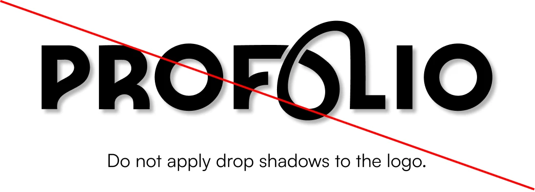
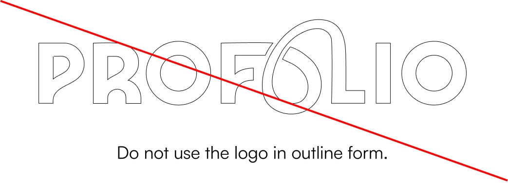
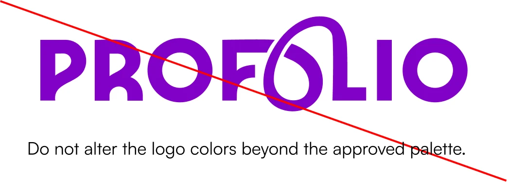
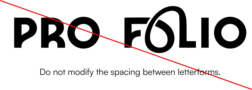
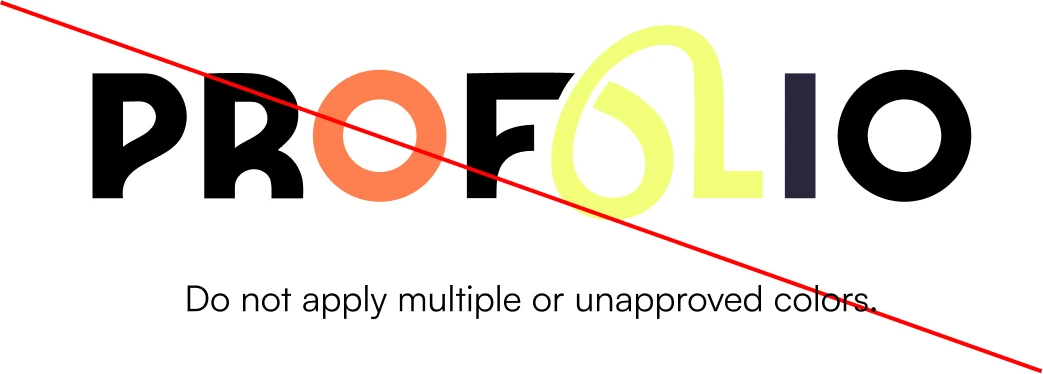
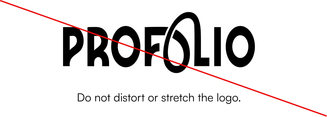
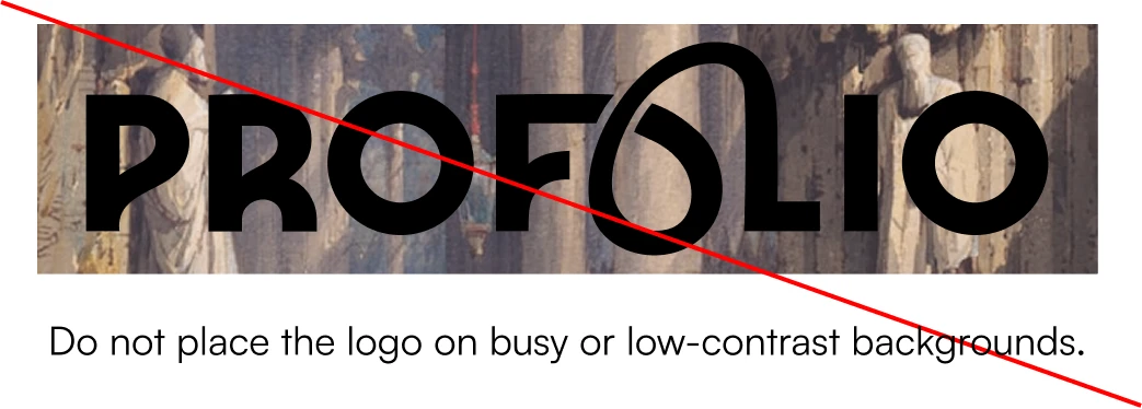
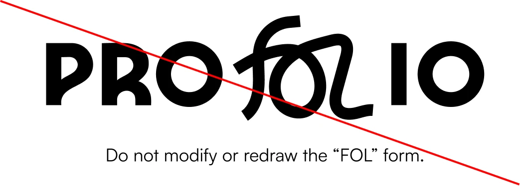
Do's & Don'ts from the brand manual
Color System
A refined color system anchors the brand with a confident primary palette, supported by neutral and accent tones that provide flexibility while maintaining accessible contrast across digital and print applications.
Core Palette Specifications
Approved Brand Mark Colorways
Core high-contrast brand combinations rendered natively with the brand mark vector SVG.
Colorway Mixer
Pair a mark color with a background. Unapproved combinations stay blocked so the system stays intact.
Approved combination.
Mark
Background
Typography System
The typographic system pairs Satoshi and Inter by field color: Satoshi on ProFolio Blue for display, Inter on Accent Lime for body and UI. The matrix below keeps that pairing intact across every weight.
Weight & Contrast Matrix
Lime fields set Inter for body and UI. Blue fields set Satoshi for display. Hover a letter to isolate it.
Satoshi
Used for headings and display. Lives on the blue fields.
Satoshi is a contemporary sans-serif typeface that brings character and warmth to the system. Its smooth curves and balanced geometry make it suitable for both digital and editorial applications.
UPPERCASE
ABCDEFGHIJKLMNOPQRSTUVWXYZ
LOWERCASE
abcdefghijklmnopqrstuvwxyz
NUMERALS & SYMBOLS
0123456789 !@#$%^&*()_+-=[]{}
Inter
Used for body text and UI. Lives on the lime fields.
Inter is a modern sans-serif typeface designed for clarity and readability on screens. Its open forms and balanced proportions make it ideal for digital interfaces and structured layouts.
UPPERCASE
ABCDEFGHIJKLMNOPQRSTUVWXYZ
LOWERCASE
abcdefghijklmnopqrstuvwxyz
NUMERALS & SYMBOLS
0123456789 !@#$%^&*()_+-=[]{}
Typographic Scale & Hierarchy
Design Your Future
Creative Thinking Without Guardrails
Curated Portfolios for Global College Admissions
Guiding students through deep artistic explorations, technical execution, and rigorous critique to craft standout applications for top global art & design universities.
PROFOLIO REBRANDING · BRAND MANUAL & TYPOGRAPHIC SYSTEM
Stationary & Collateral
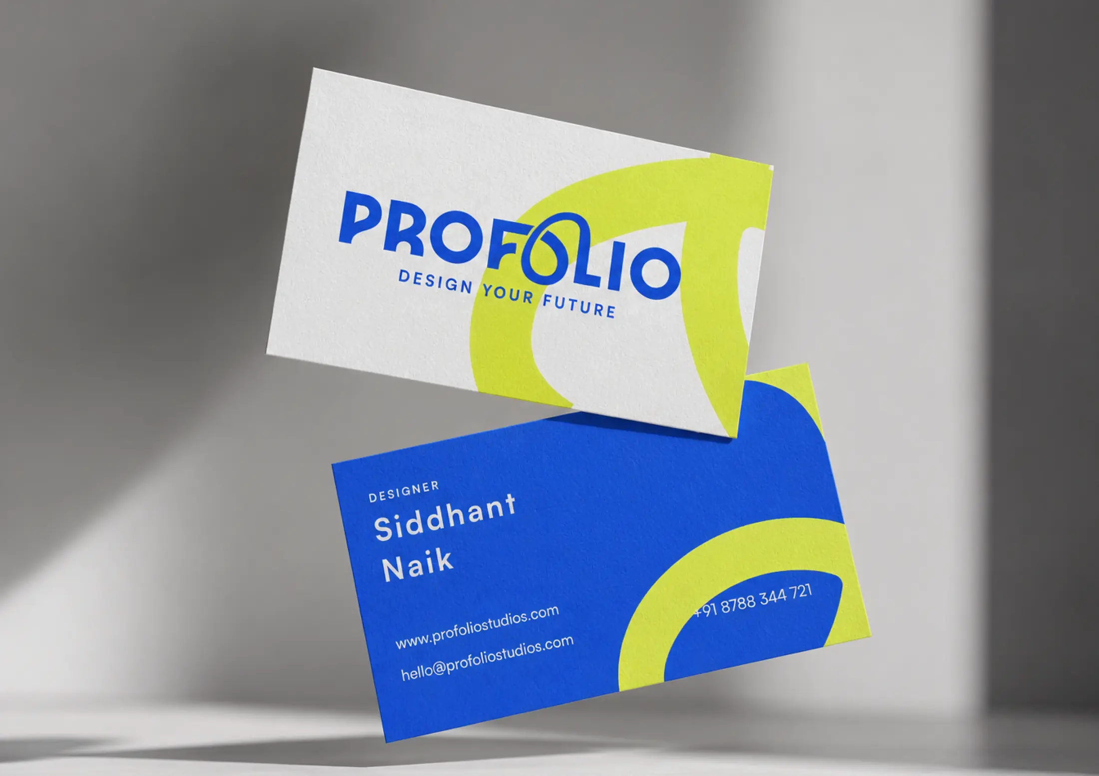
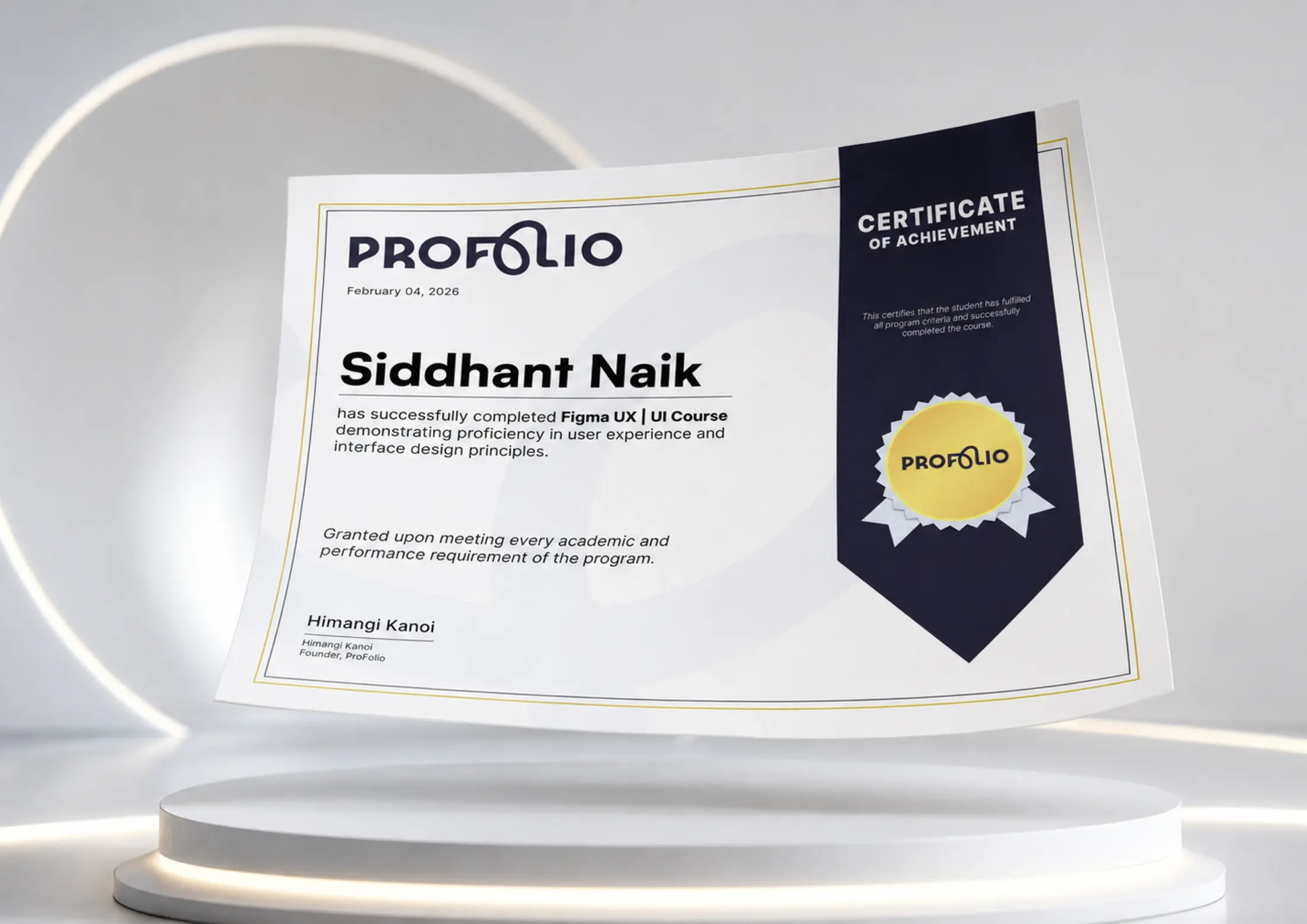
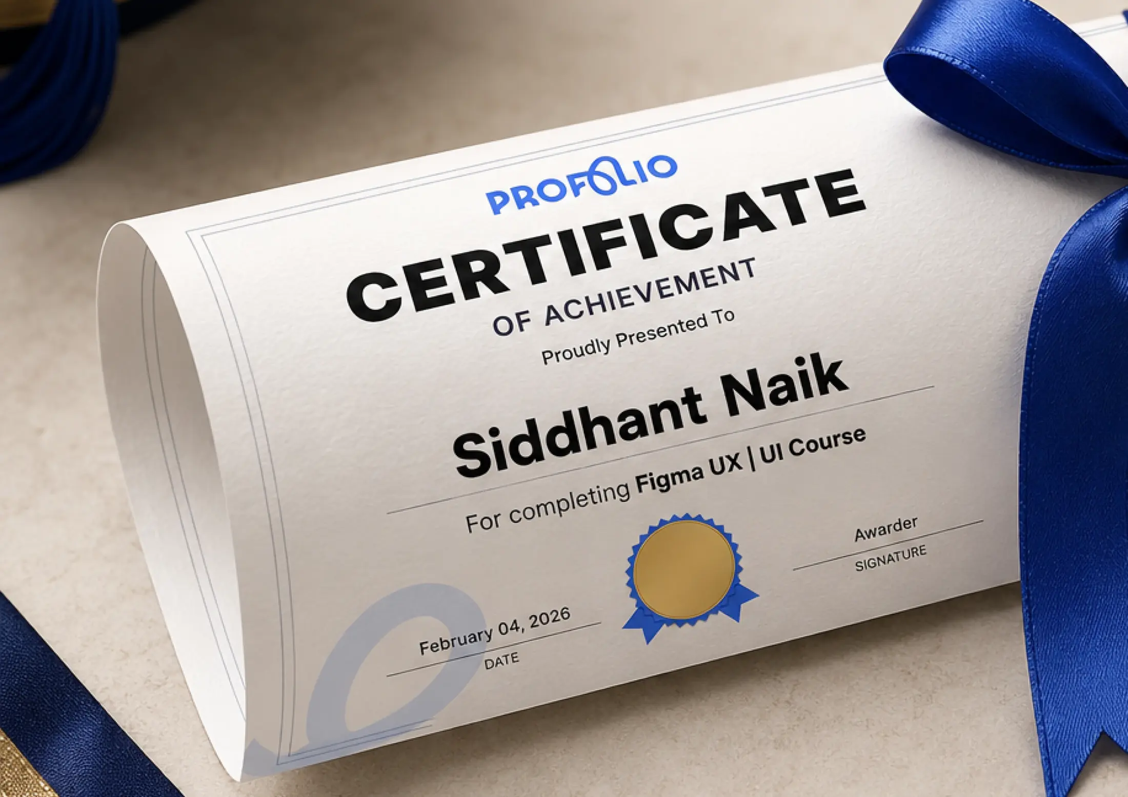
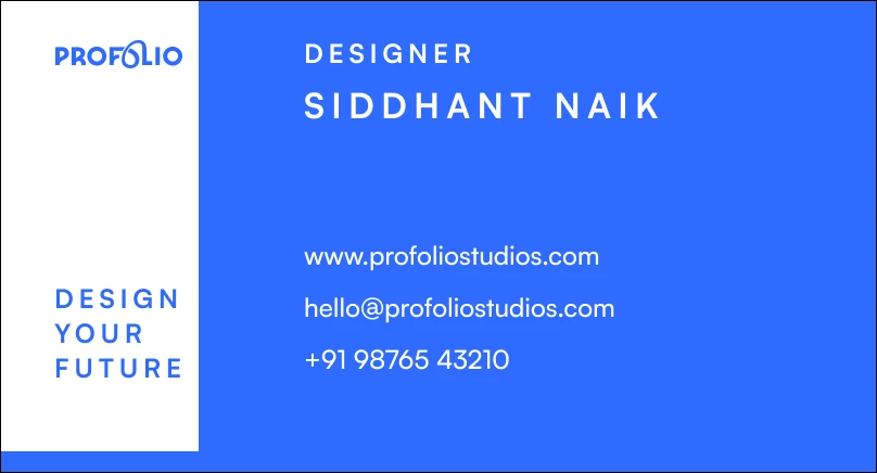
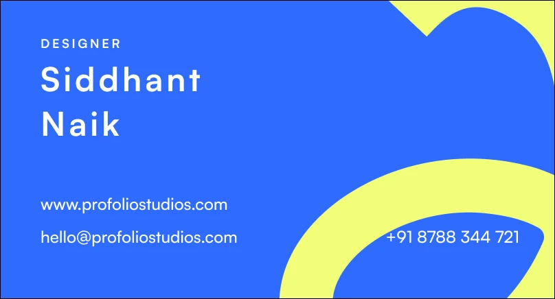
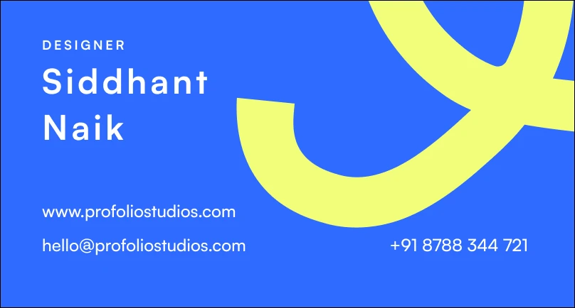
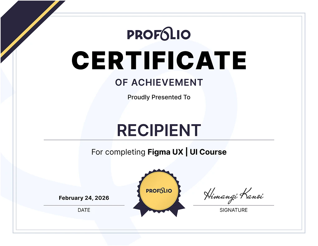
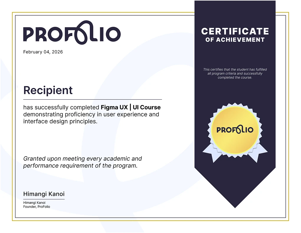
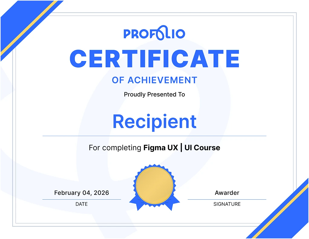
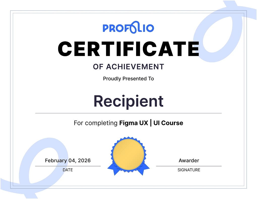
The visual identity extends into precision stationery, certificate designs for student recognition, and a multi-variant business card system accommodating diverse roles and layouts.
Business Cards
Click or tap the card to turn it over. Front carries the contact lockup; back carries the mark and tagline.
FrontAdditional layout options across the approved colorways.

Certificates of Achievement: Layout Options
Official certificate templates designed for course completions, student distinctions, and program credentials.
Digital Platform & Web Experience
A full-featured digital platform designed and engineered to translate mentorship into an intuitive digital experience. Built with Next.js 14, TypeScript, and Tailwind CSS, the platform achieves a 98 Performance and 100 Accessibility score, serving as both an admissions resource and a commercial showcase for prospective students and institutional partners.
Multi-Device Responsive System
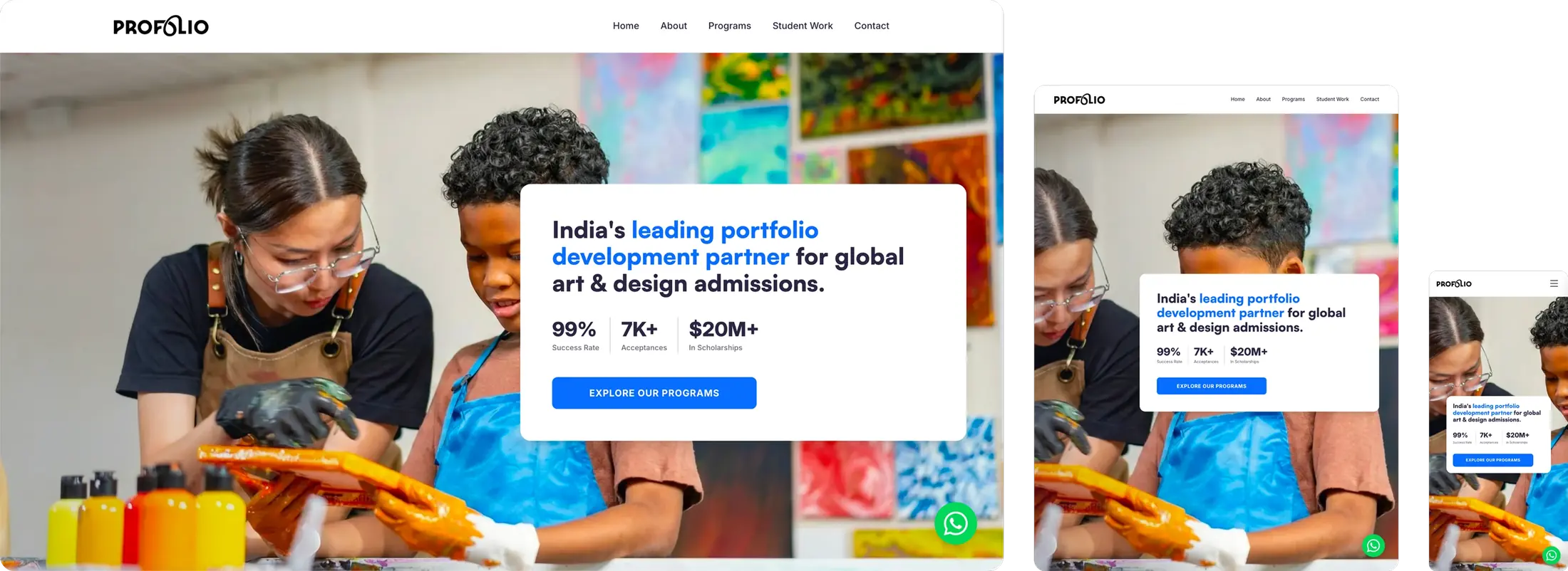

A/B Testing & Conversion Optimization
To maximize consultation bookings, parental trust, and student engagement, key user touchpoints across the digital platform were evaluated through pairwise A/B testing to measure visual hierarchy, narrative framing, and conversion friction.
Drag the handle to overlay Variant A against Variant B. The shipped treatment is marked on each test.
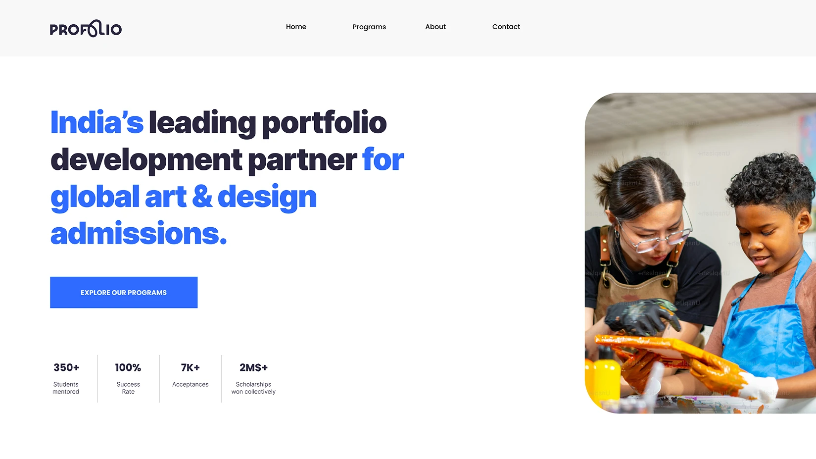
Hero Value Proposition
Evaluating broad creative mentorship messaging alongside direct institutional admissions positioning, measuring user clarity and immediate geographic relevance across both directions.
 B · Shipped
 A
AShipped Variant B. Admissions-specific language reduced ambiguity for parents and students scanning the first screen. Mentorship is still present, but it is no longer the only promise.
Impact & Metrics Display
Comparing isolated numerical stat counters against an integrated contextual narrative section explaining the outcome behind each student metric.
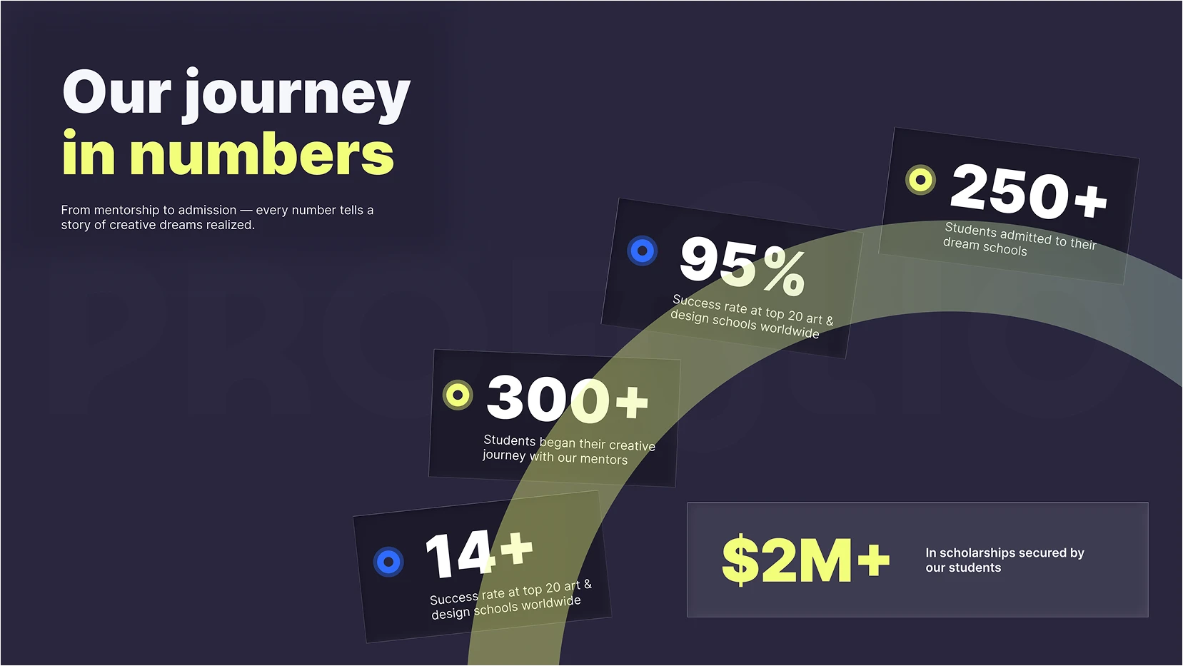 B · Shipped
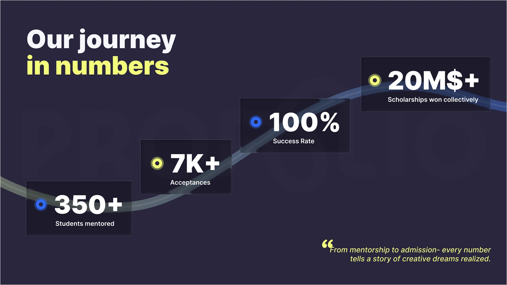 A
AShipped Variant B. Numbers without context looked like marketing. Pairing each metric with a short outcome made the proof feel earned instead of inflated.
Admissions & Student Work Showcase
Testing student project thumbnails paired with university acceptance crests against quote-based editorial student testimonials.
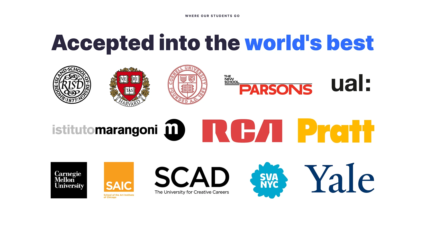 B
B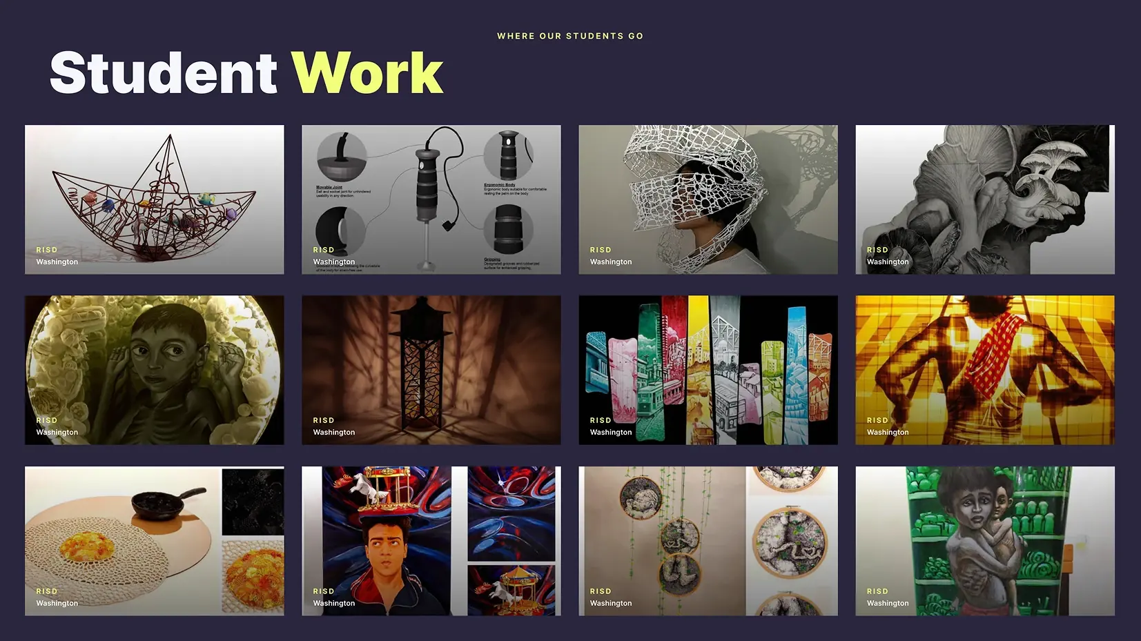 A · Shipped
Shipped Variant A. Visible student work plus acceptance crests verified outcomes faster than quotes. Proof of craft mattered more than praise.
Mentor Credentials & Faculty
Testing institution alumni badge tags against descriptive role titles to evaluate speed of credential verification.
 B
B A · Shipped
Shipped Variant A. Institution marks were recognized in a glance. Role titles required reading, so credential trust formed more slowly.
Consultation Funnel & CTA
Evaluating lead generation friction between an immediate multi-field application form and a low-barrier free consultation booking flow.
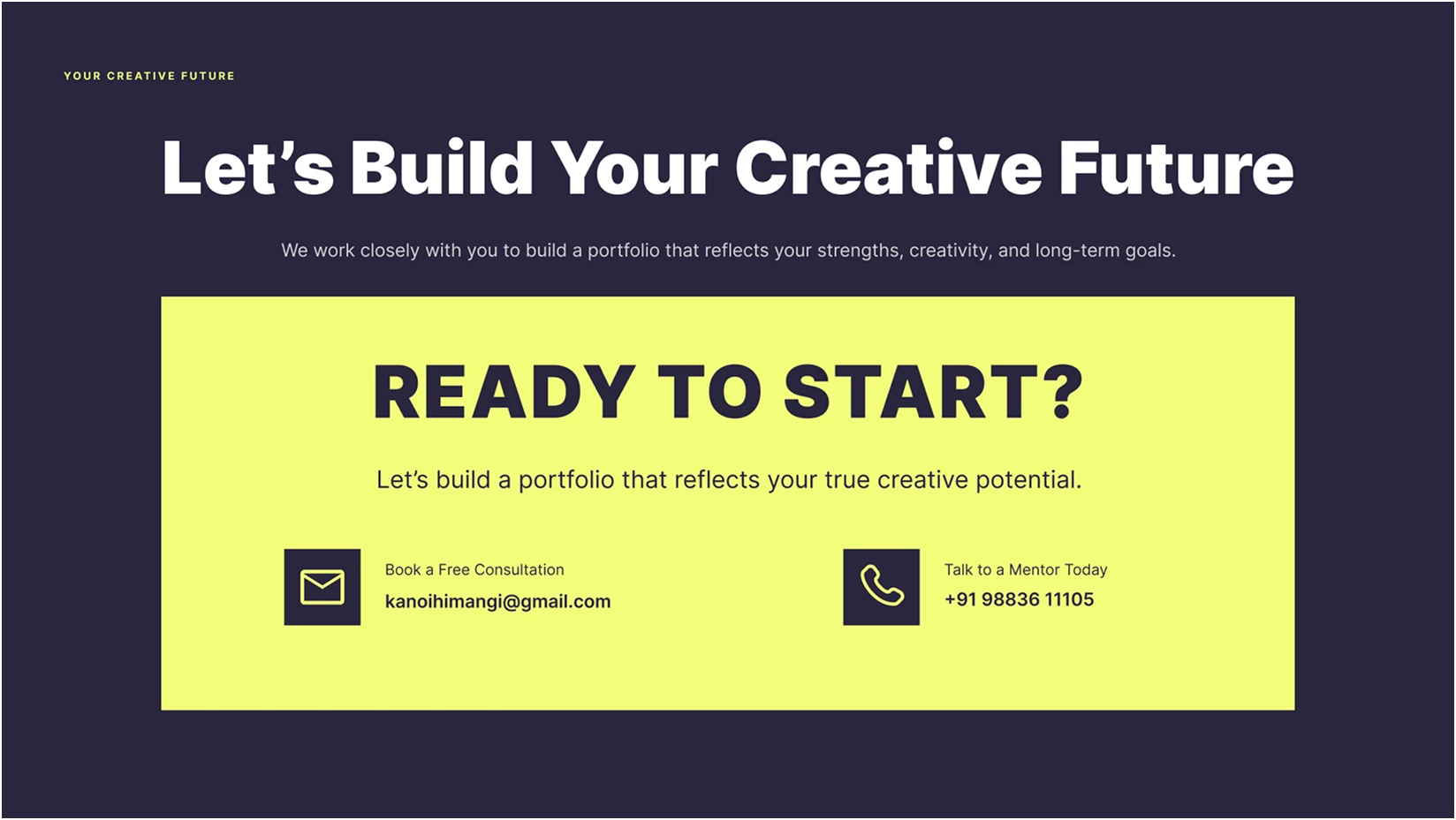 B · Shipped
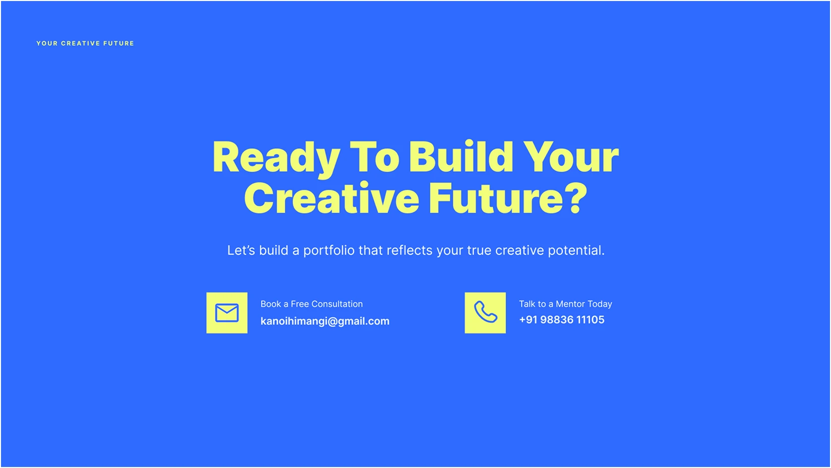 A
AShipped Variant B. The application form asked for commitment before trust. A free consult was a smaller first step and converted more inquiries.
School & Counselor Partnerships
Testing structured partner categorization tiers (Schools, Counselors, Design Studios) against general contact outreach.
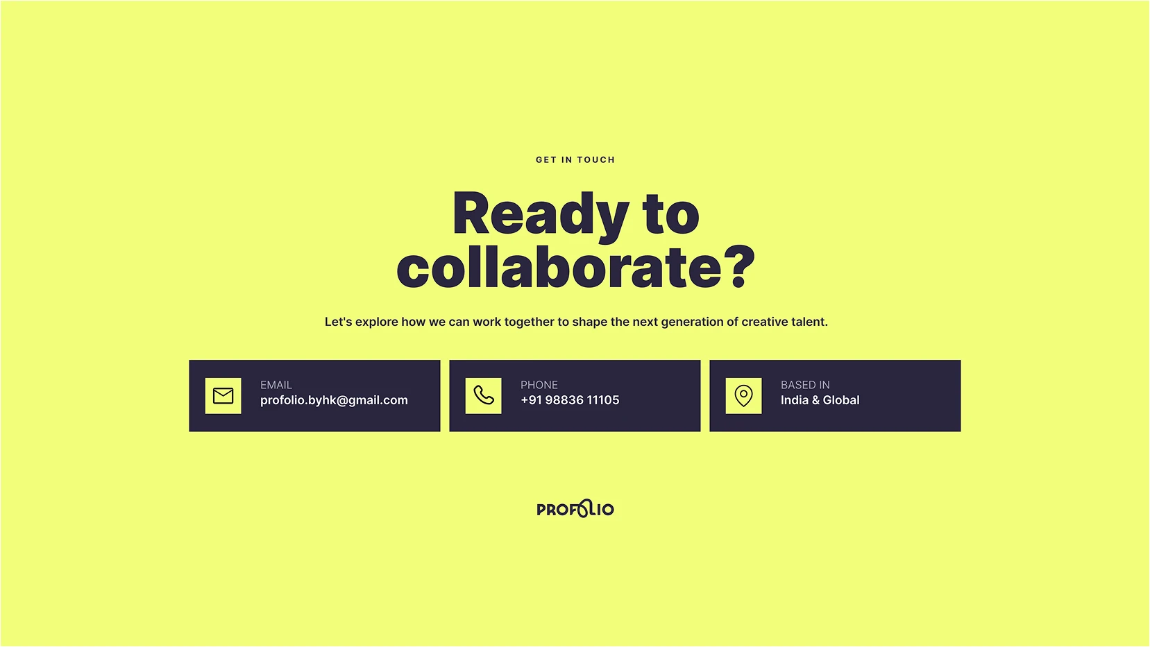 B
B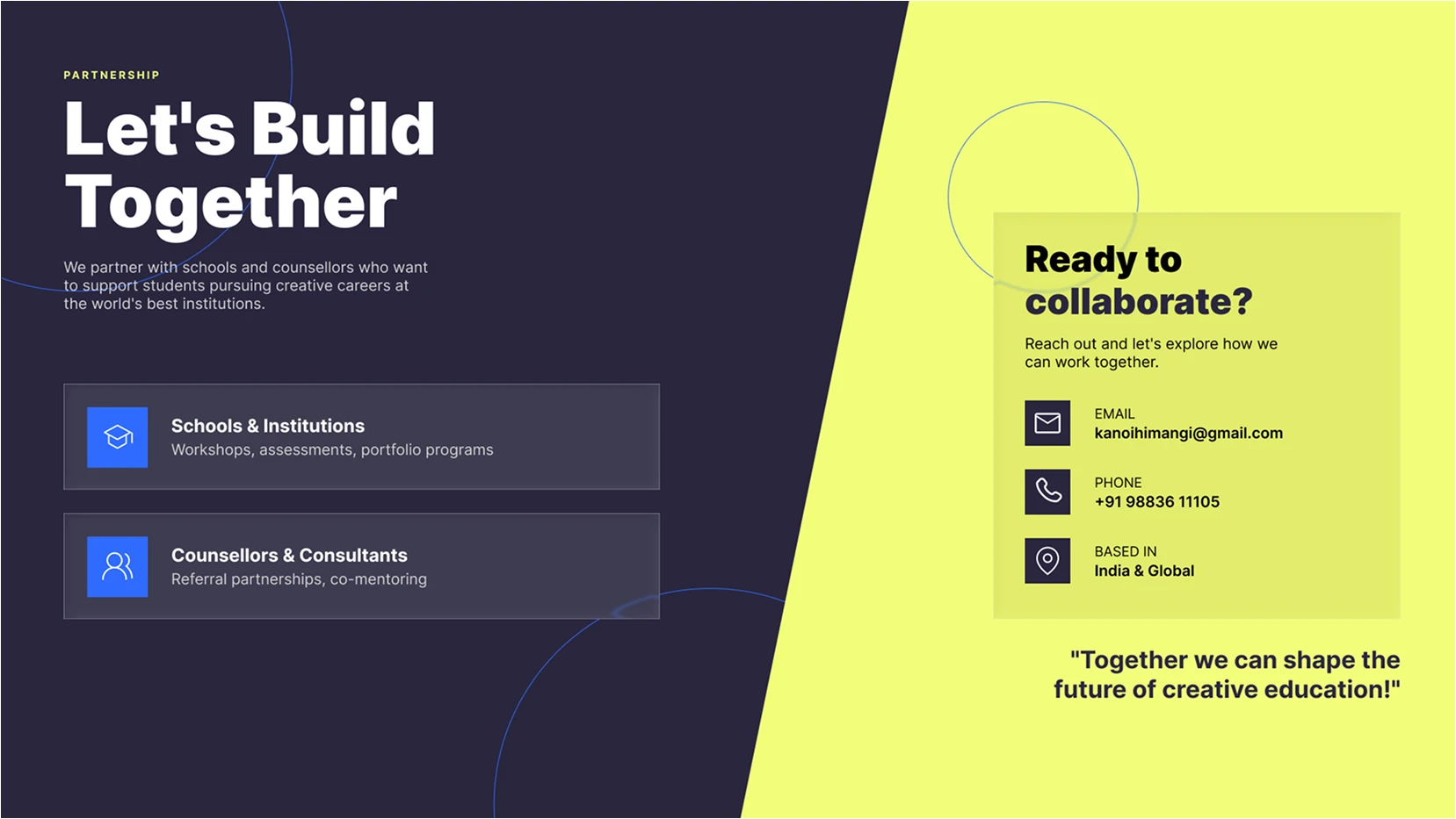 A · Shipped
Shipped Variant A. Segmented entry points told each partner type where they belonged. A generic inbox made the program feel unspecific.
Project Gallery
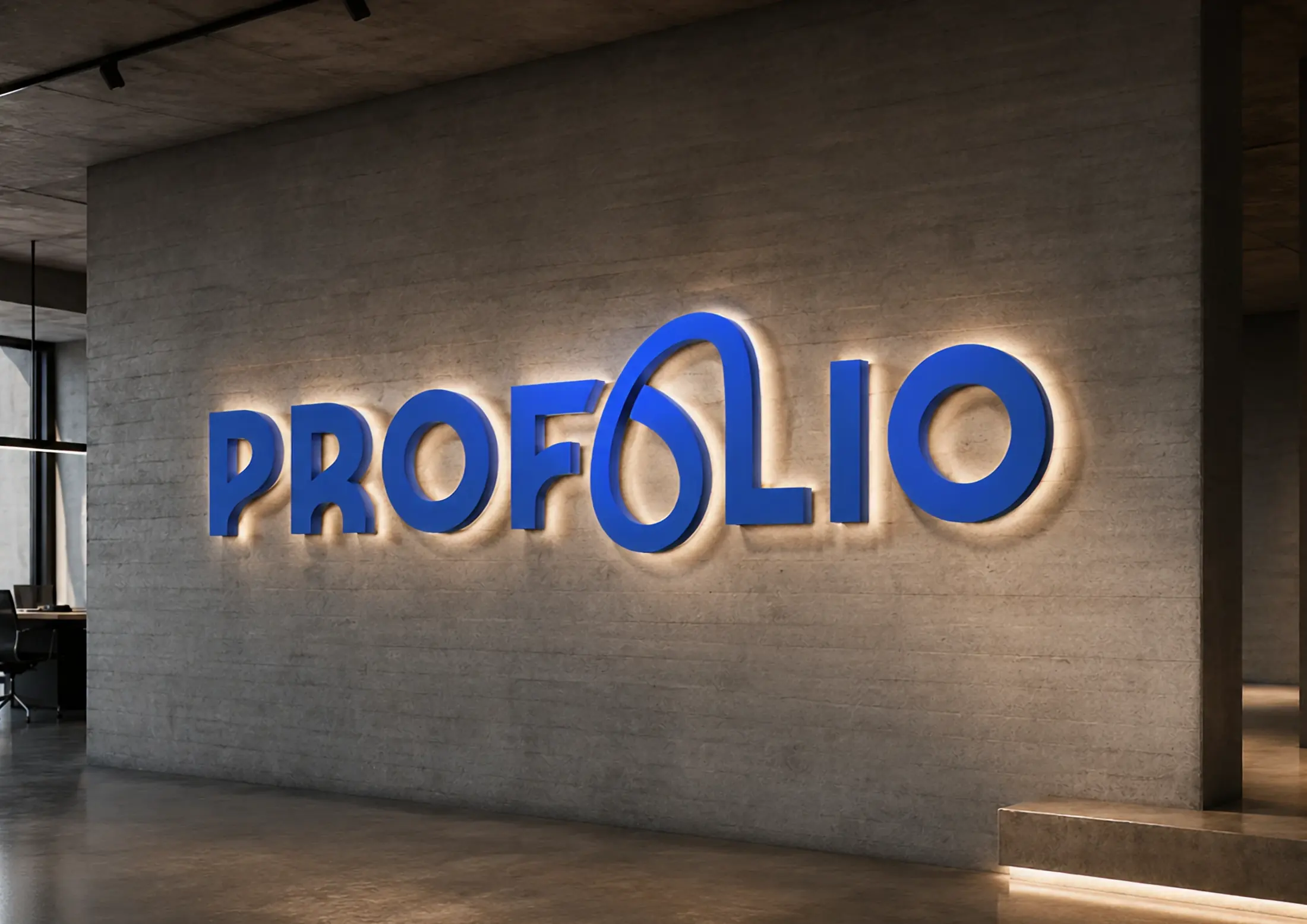
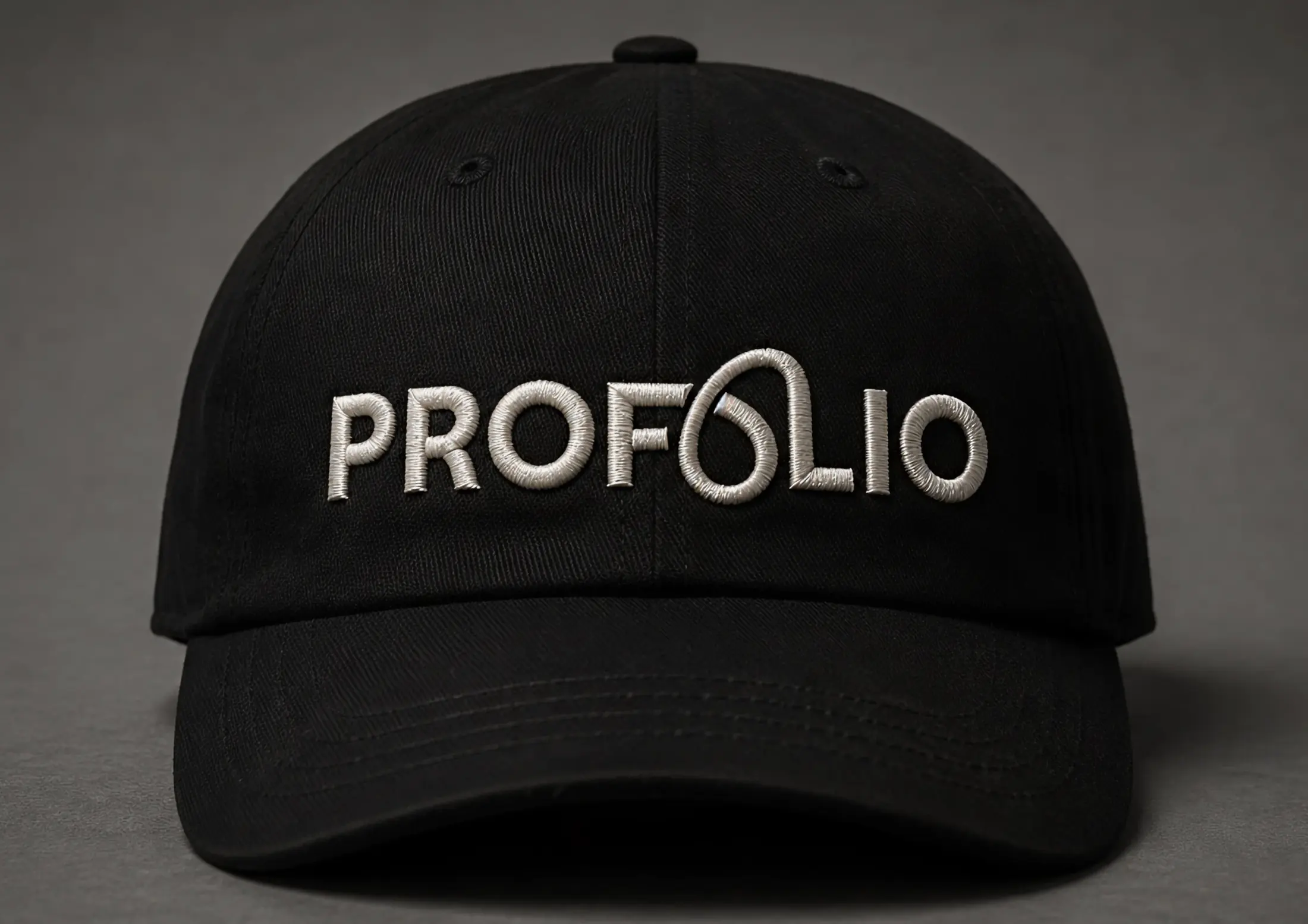
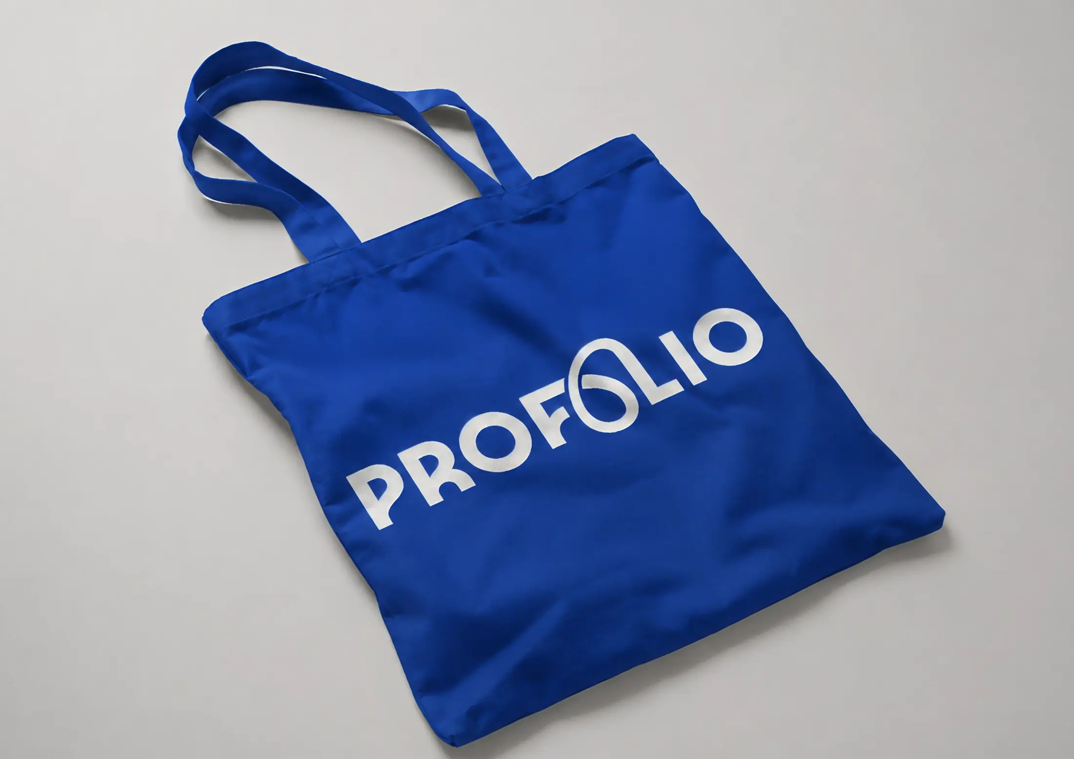
Tangible brand realization and physical touchpoints created for ProFolio: spanning architectural environmental signage, corporate stationery, student certification awards, apparel, merchandise, and illuminated 3D glass brand marks.